Everyday project styles, landing pages, back-office and data products, and the styles that make a page memorable. Each card is a real rendered design in that style, the three attributes that identify it, when it is the right answer, and the words to paste into your agent.
all of them on the wall · new styles added daily · every card is a rendered design, not a diagram · the keywords are the payload
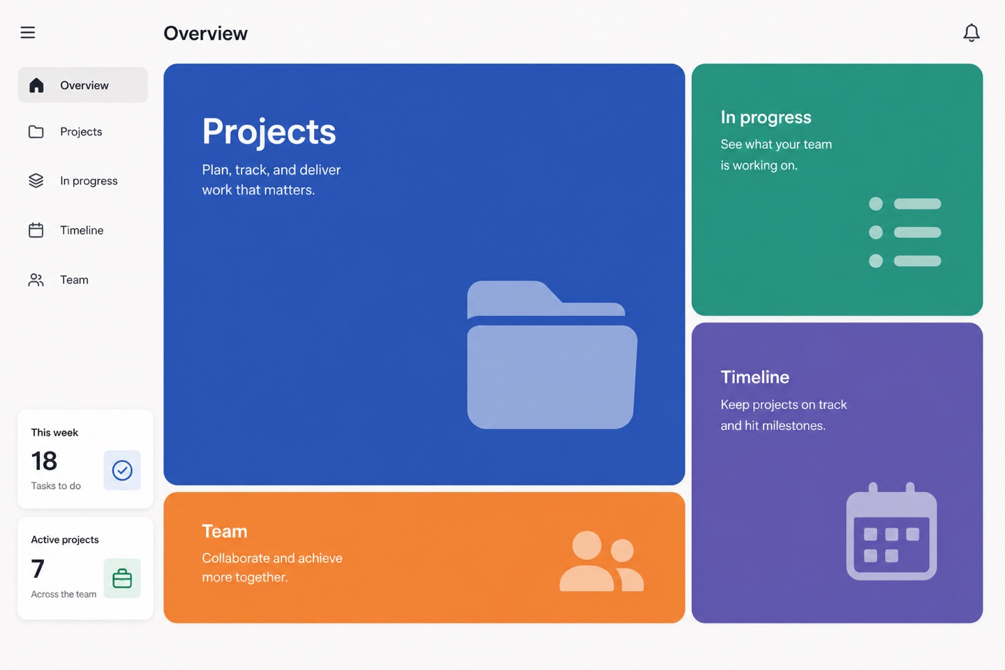
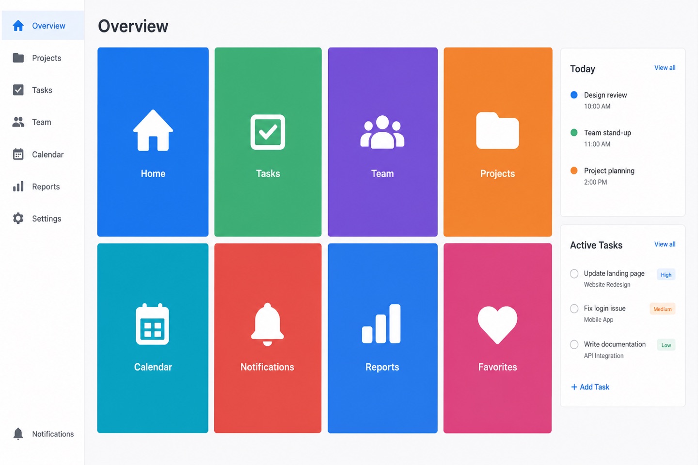
Many features and mixed information, with no single thing that deserves the whole screen. Tiles may differ in size, but the largest has to be obviously largest — otherwise it reads as a tidy cupboard rather than a hierarchy.
Pages that earn order from the grid, the type scale and white space instead of decoration. Steady for enterprise tools, documentation sites and professional consoles — as long as the operational feedback does not get deleted along with the ornament.
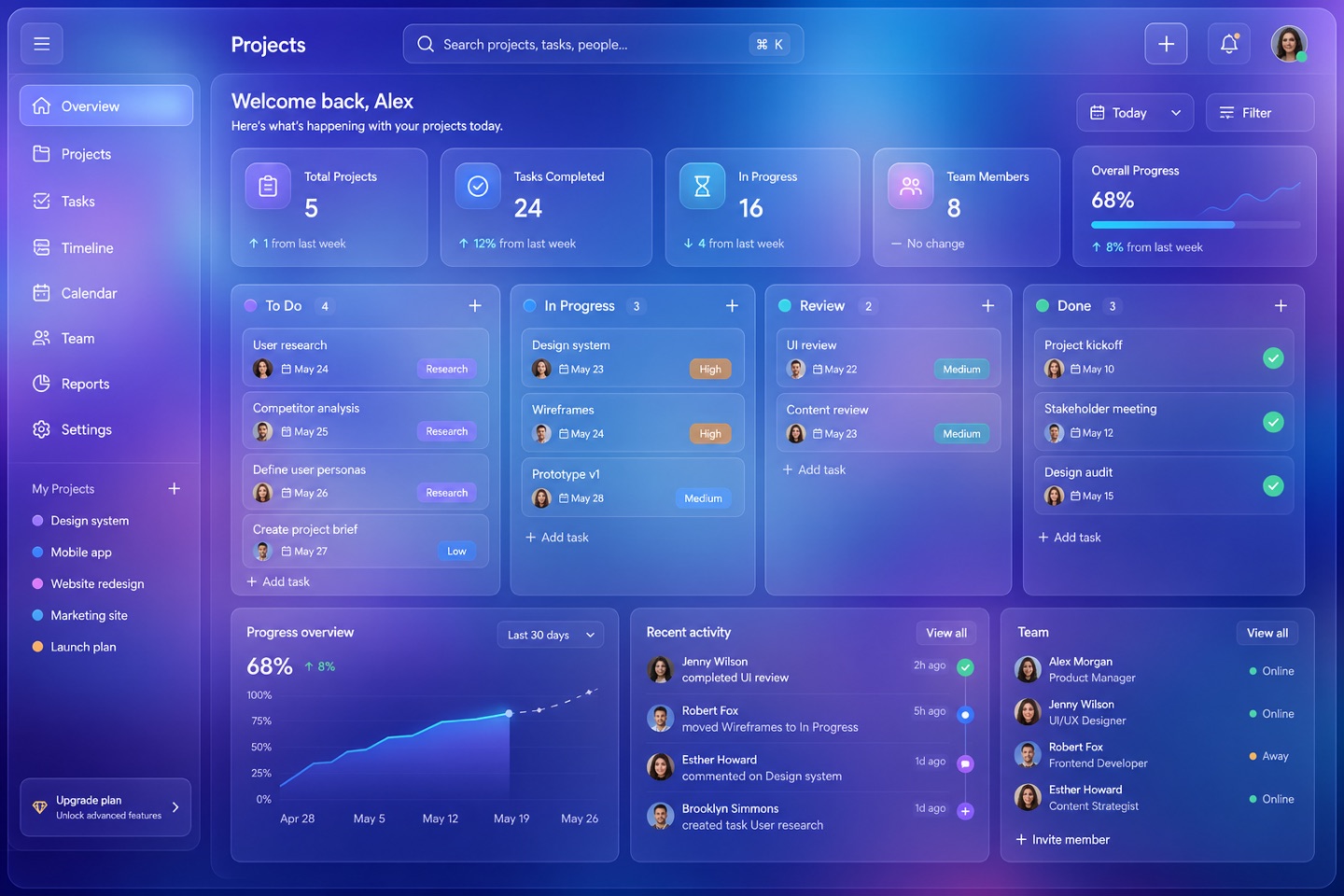
The lightness of translucent cards floating over a background. The moment the backdrop gets busy the text smears, so blur, borders and contrast have to be tuned together.
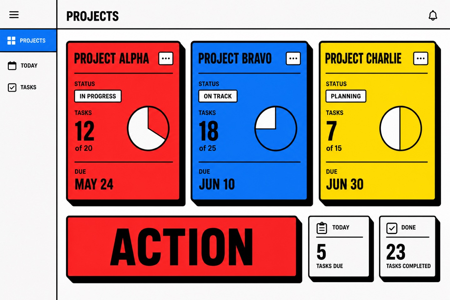
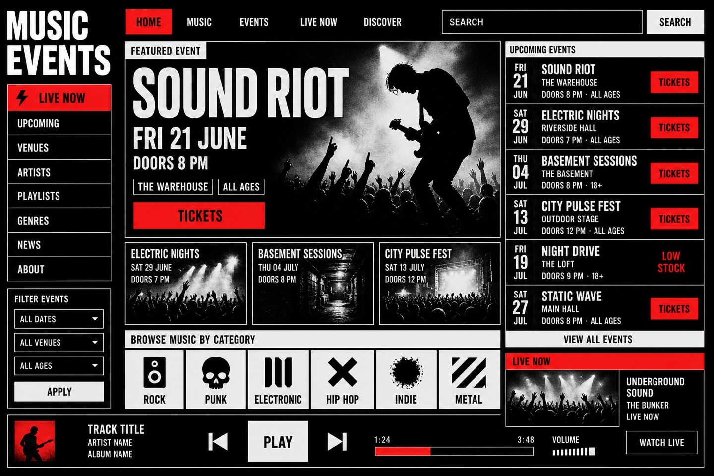
Thick black borders, hard shadows and saturated primaries give a page a temper immediately. Right for young brands and creative tools; be careful dropping it into finance or healthcare.
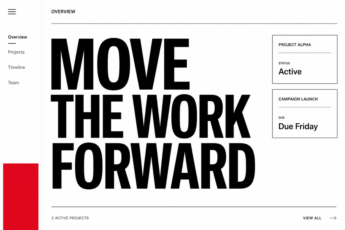
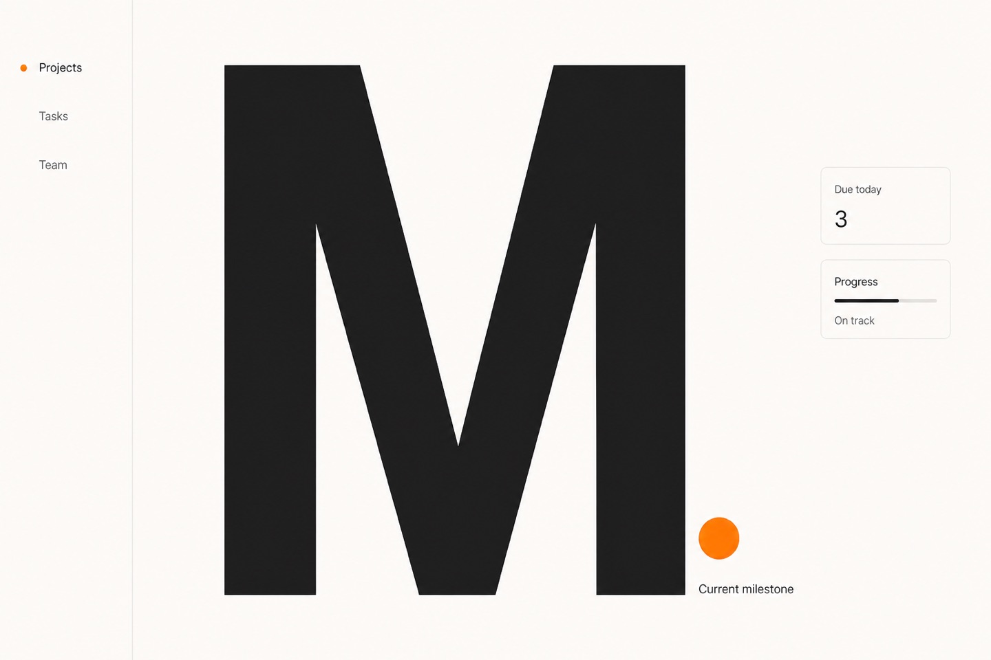
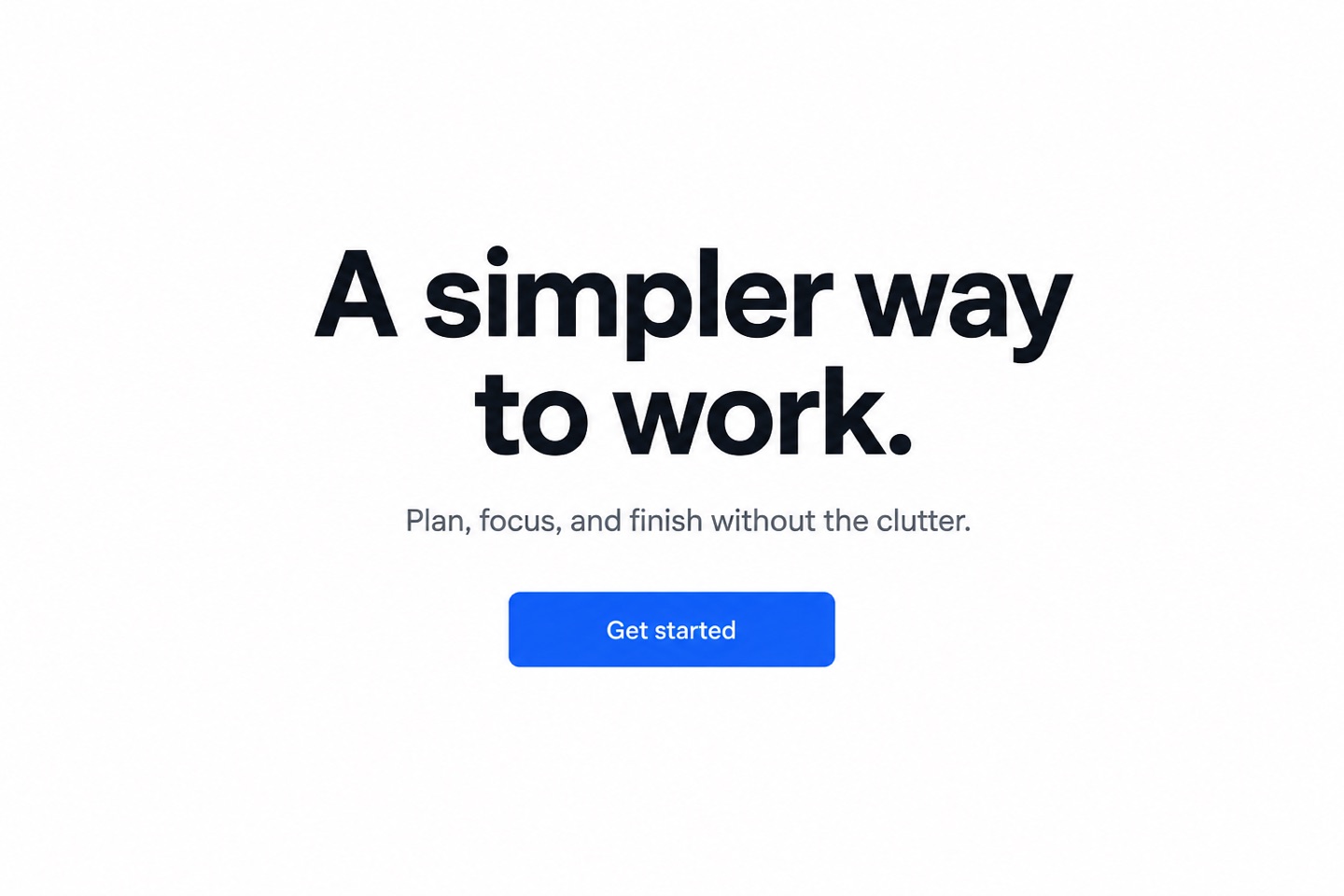
The page looks empty but speaks loudly: enormous type against extreme whitespace. Made for fashion, architecture and portfolios — never force a complex form into it.
oversized typographyextreme whitespacehigh contrastone accent color
Still a workhorse, especially on mobile and for products that need to ship fast. Icons, color and type hierarchy must carry the weight — once shadows are gone, buttons disappear with them if contrast is weak.
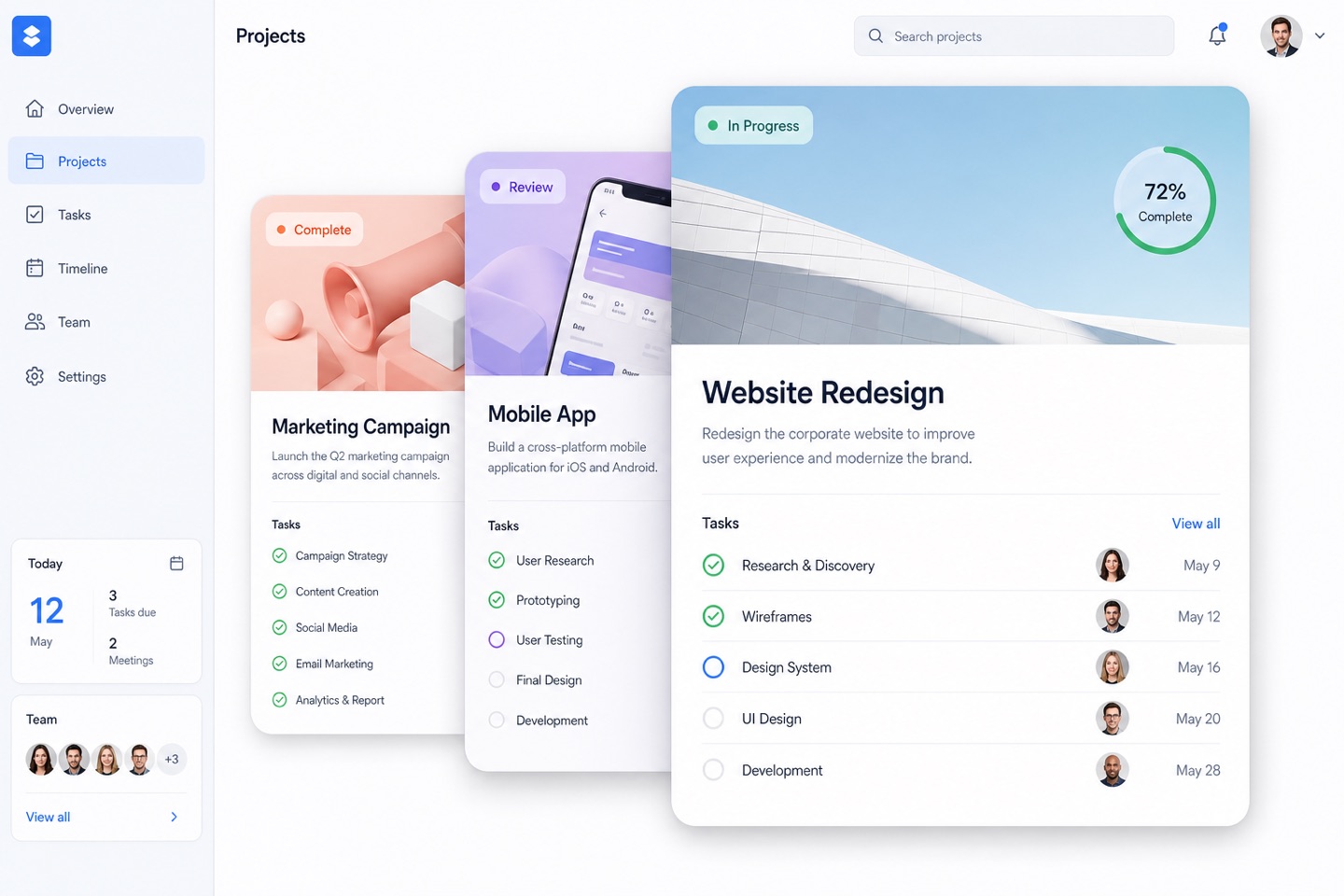
Overlap, shadow and blur lift the important content gently off the page — card systems and modals thrive on it. Keep the layer count low, or the whole page turns grey.
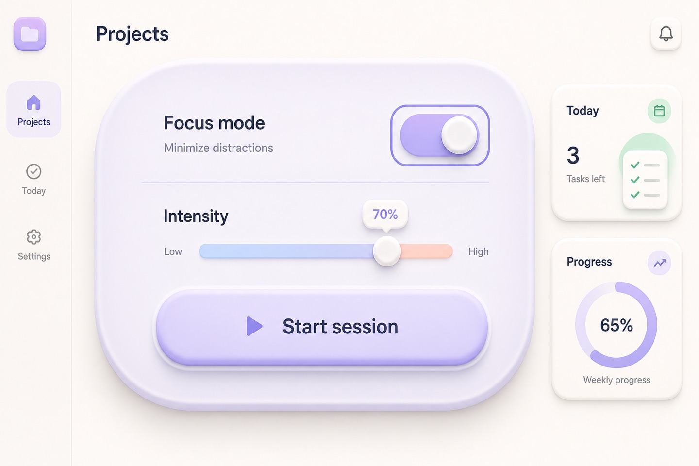
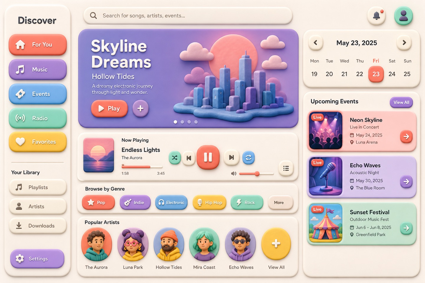
Keeps the soft shadows and gentle touch of early neumorphism while fixing its contrast problem. Fits health, lifestyle and light SaaS — buttons and focus states still have to read clearly.
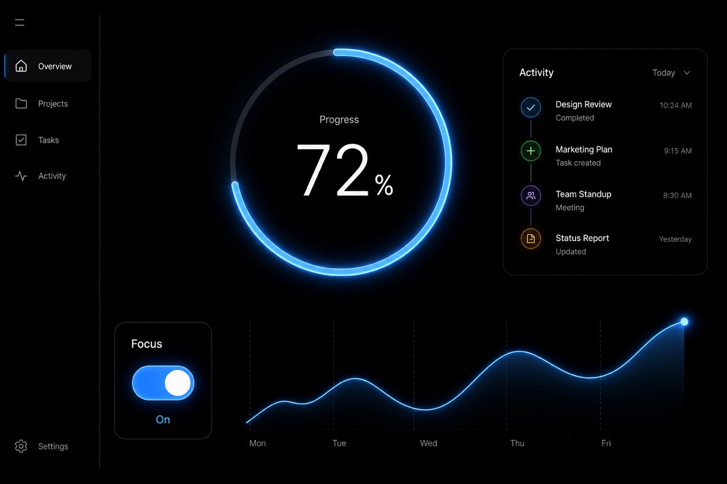
A comfortable dark mode is restrained — no line of text should glare. Developer tools, media and night-time apps live here; on a pure black ground, text brightness needs the most care.
deep blackmuted whitehigh contrast accentsnight viewing
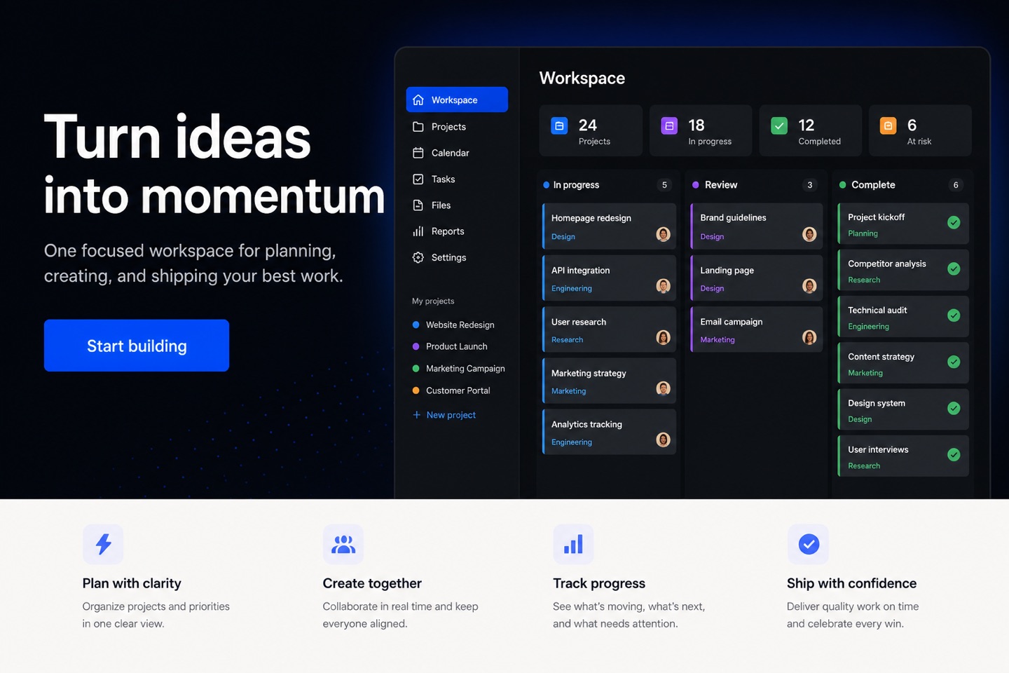
The first screen does one job: make the value obvious. A strong headline, one product visual and one primary button are enough — every extra message costs the reader their next click.
large heroclear value propositionsingle CTAproduct visual
Indie products and personal services suit this straight-line structure: few words, short paths, fast decisions. A complex product cannot survive on one beautiful slogan.
single columnminimal copydirect messageone clear action
Signup, capture and campaign pages care about one thing: whether people reach the last step. There is exactly one primary action, and the form, endorsements and urgency all serve it.
form focusedsingle conversion goaltrust signalhigh contrast CTA
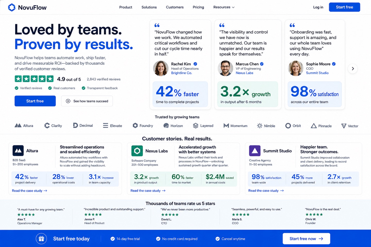
Show who already uses it, then what changed for them. Full quotes, real faces and checkable numbers persuade more than a row of stat cards — and every claim has to survive verification.
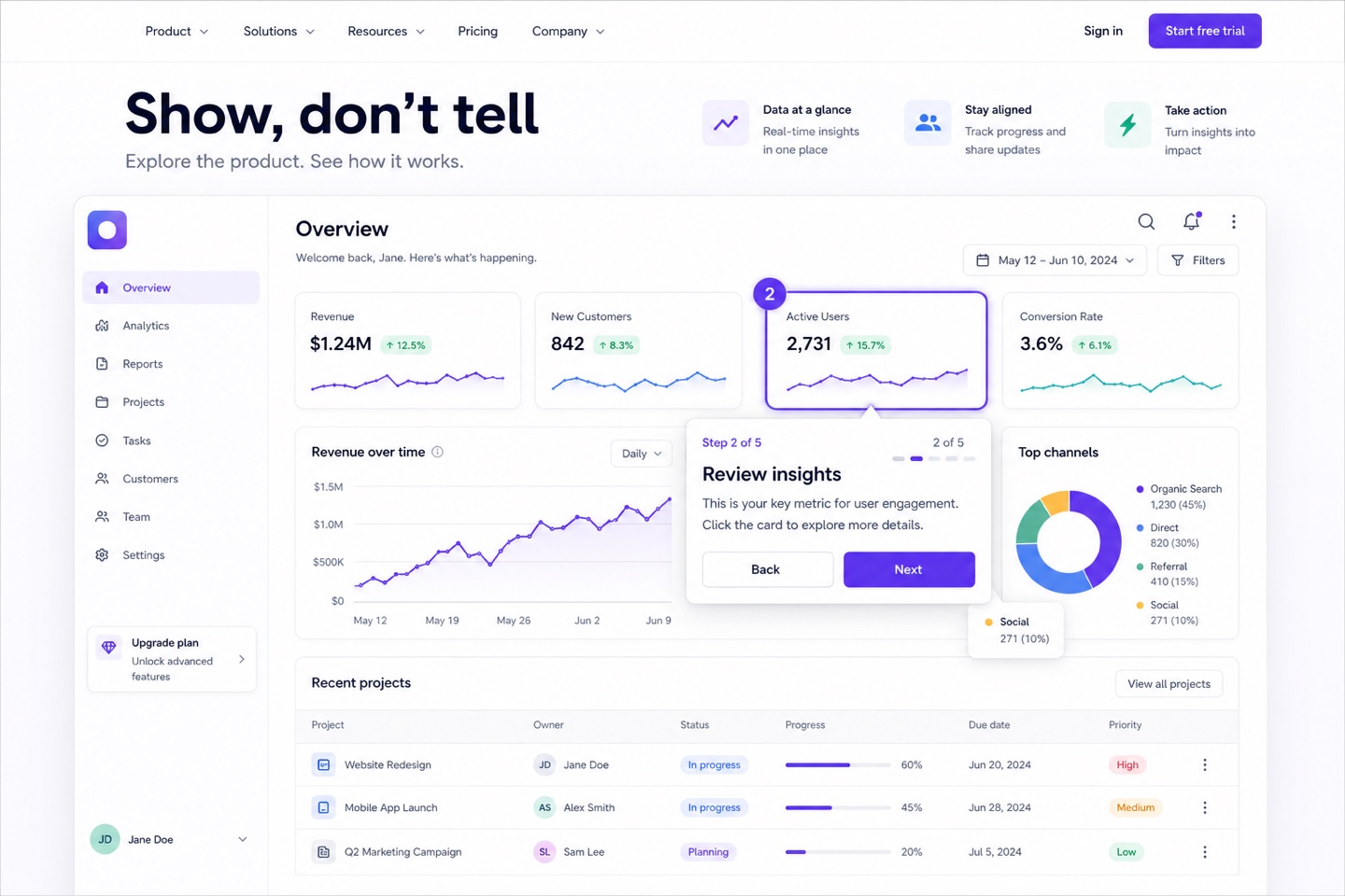
Put the product itself in front of the reader — cursor, steps and all. Right for software that needs its operation explained; the demo must never fall behind the real product.
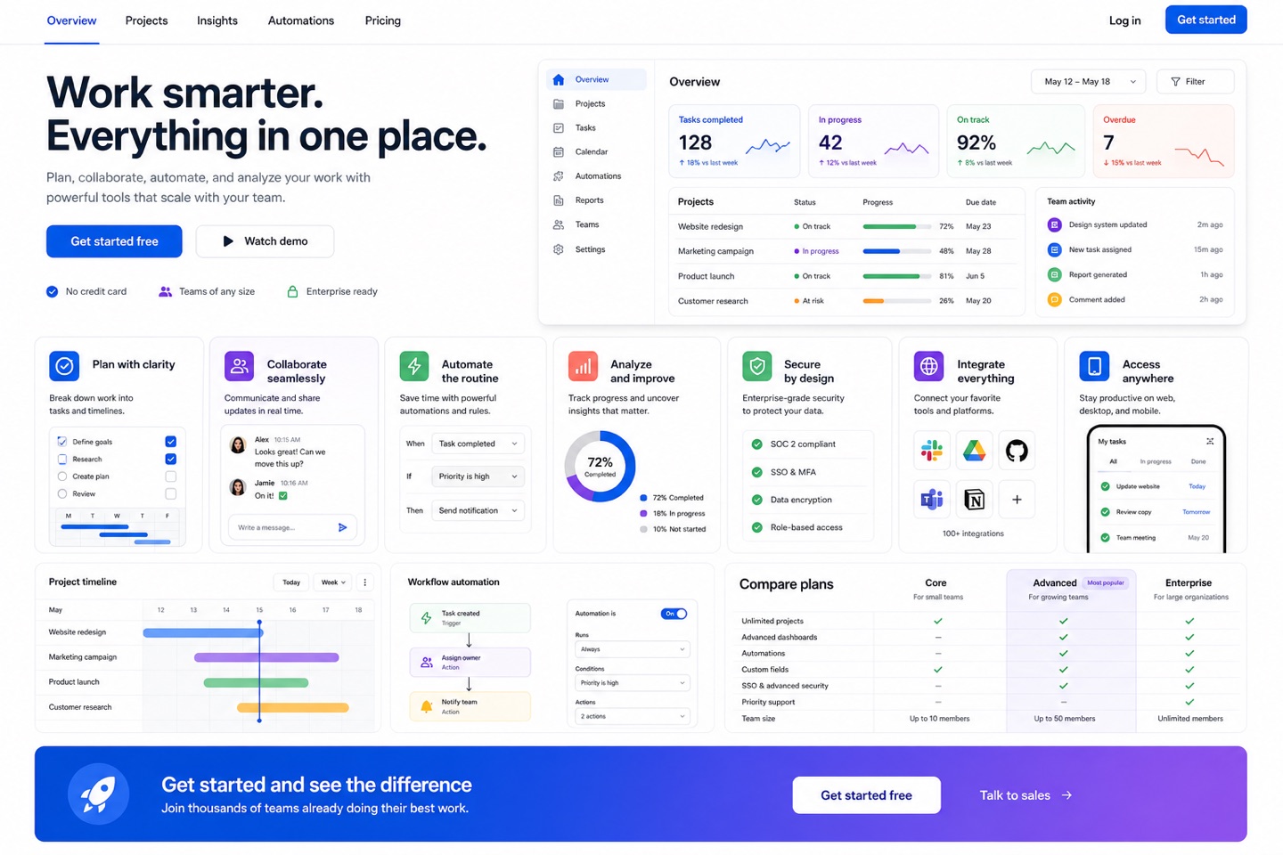
Answers what the product actually covers — a capability map. With many features, group them into sections instead of stuffing everything into same-size cards.
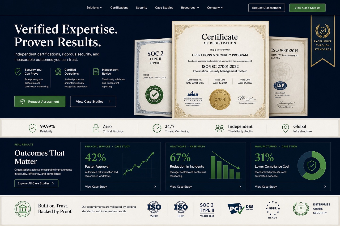
Healthcare, finance and enterprise services settle trust before conversion. Certifications, compliance badges and case numbers all work — provided every item stands up to checking.
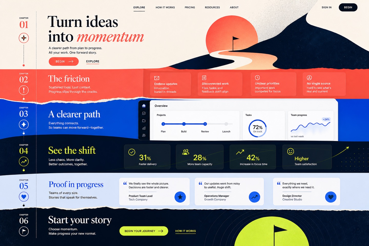
A brand story is not a company-profile paragraph — it moves forward chapter by chapter. Emotion and imagery carry the reader; keep one fast entrance for the person who just needs a fact.
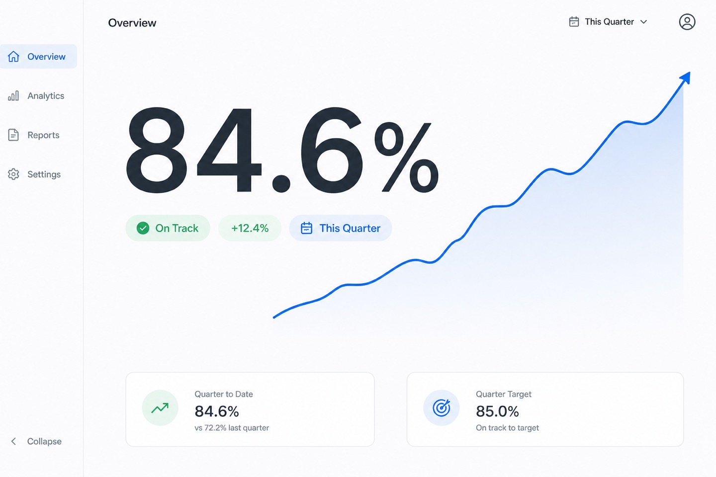
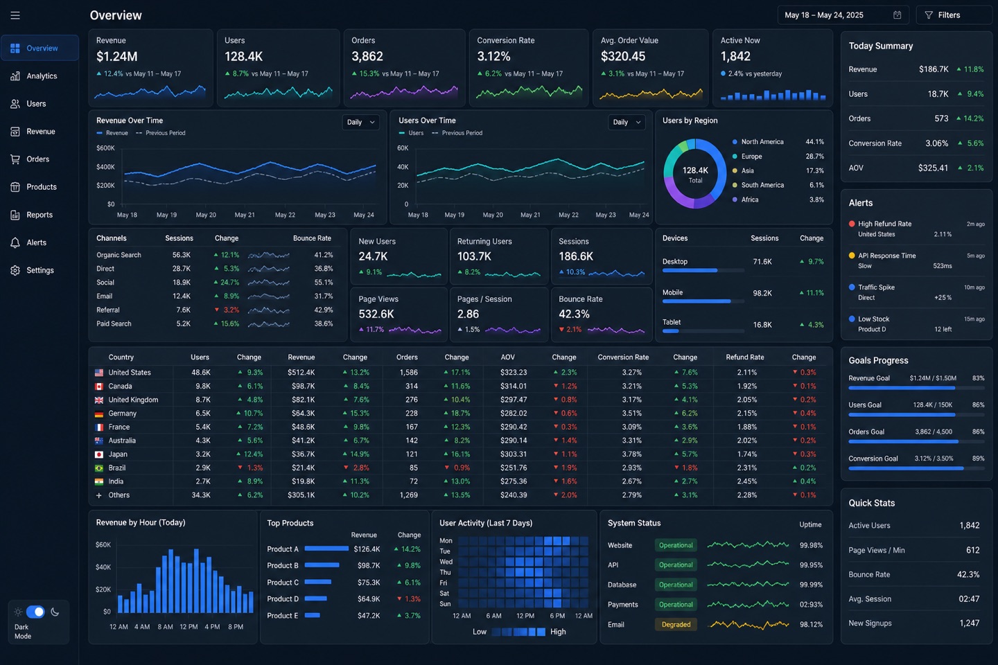
For people who stare at data all day: tables, filters and micro-trends can share one screen. Density is fine — hierarchy is not optional, and the type size never shrinks past legible.
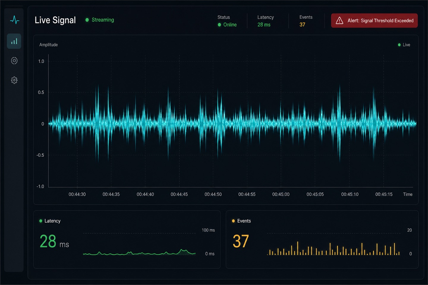
Cares about the moment change happens: waveforms, status lights and a timeline outrank history reports. Red is reserved for real alarms — when the page lights up, you must know where.
live datastatus indicatoralert notificationstreaming chart
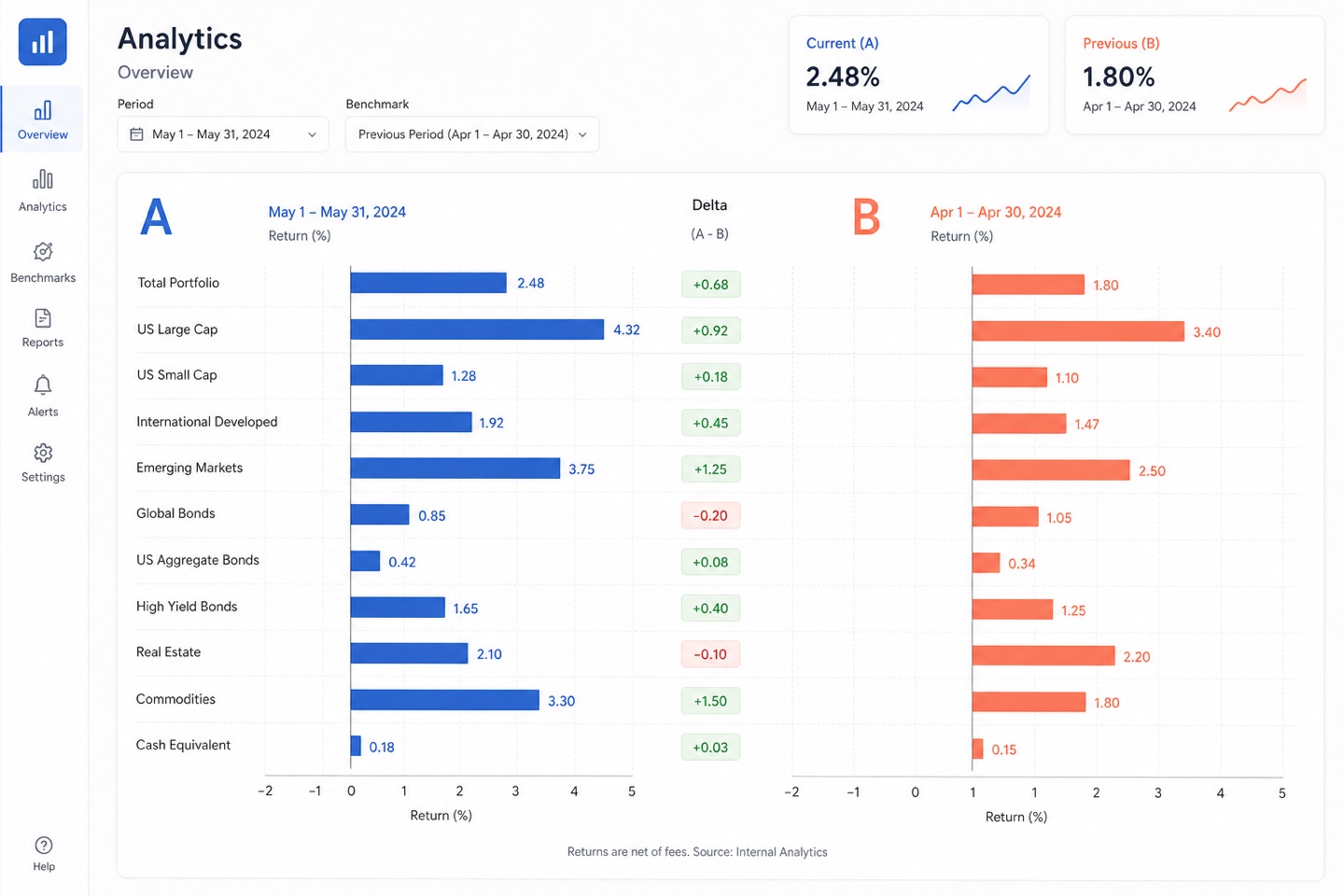
Period-over-period, regions and A/B tests all live on comparison. Once the objects multiply, stop forcing paired cards and switch to the chart that actually answers the question.
side by side comparisonperiod over periodbenchmarkvariance
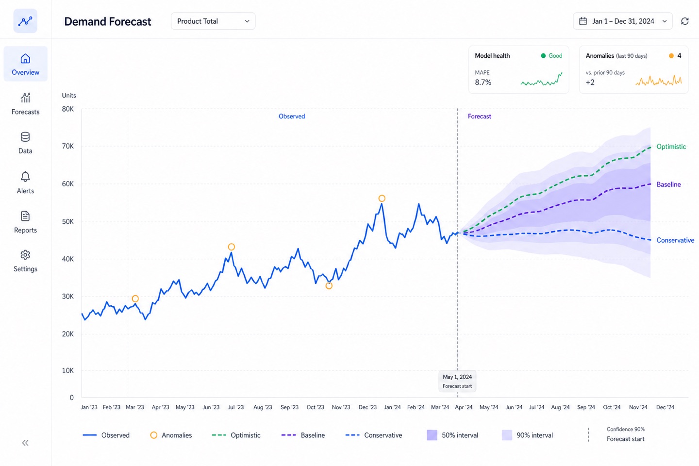
However beautiful the forecast line, it must not pose as a certainty. Trend, confidence interval and scenarios appear together, so the reader knows how much to trust the number.
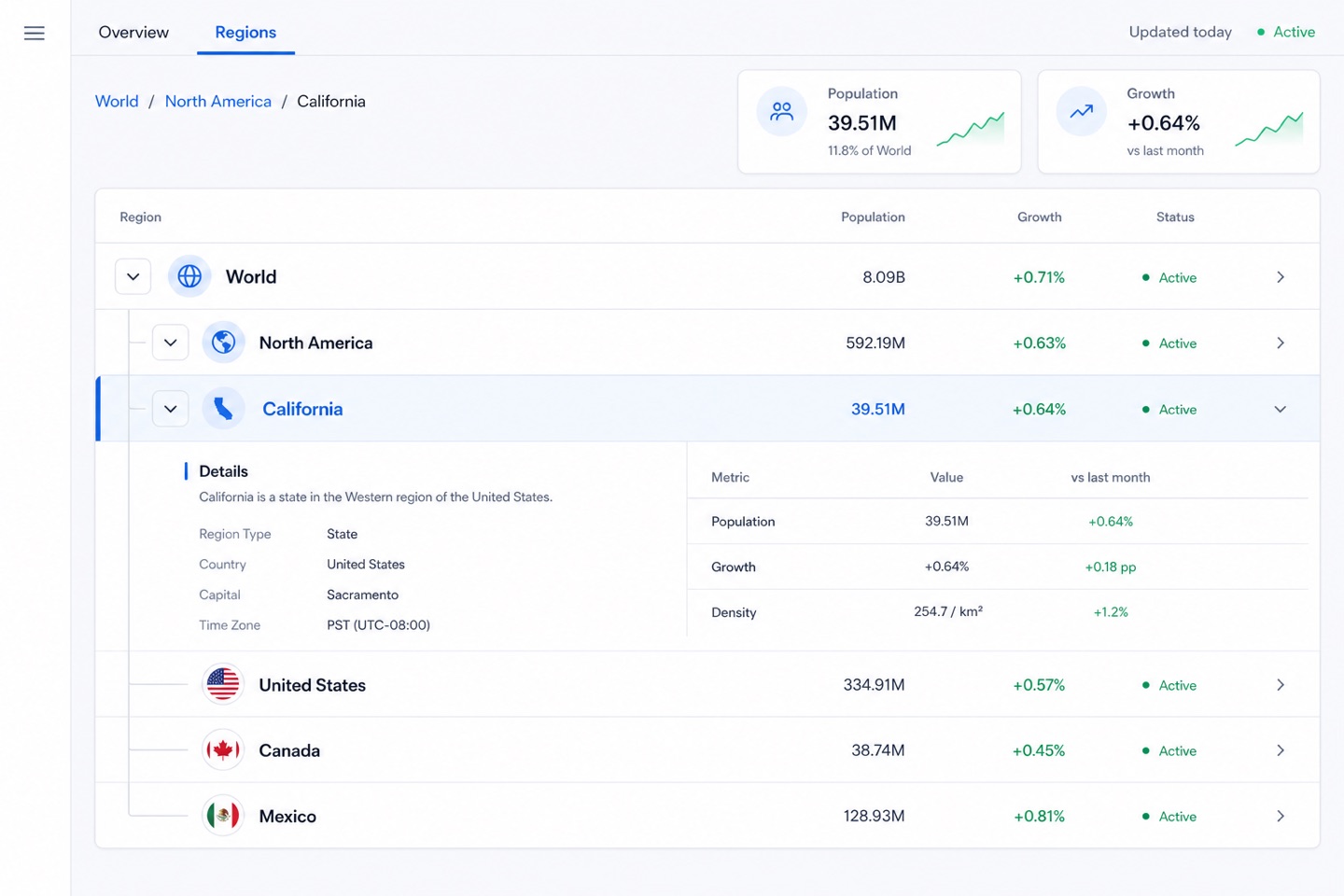
Lets someone walk from the whole down to one specific object. Tree levels, breadcrumbs and a way back matter more than another chart — the user must always know which layer they are on.
hierarchical dataexpandable detailbreadcrumbsummary to detail
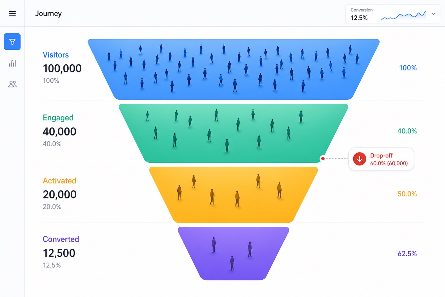
Watches how people move, not just the final conversion rate. Draw browse, consider, buy and churn as one path and the problem shows itself faster than isolated numbers ever would.
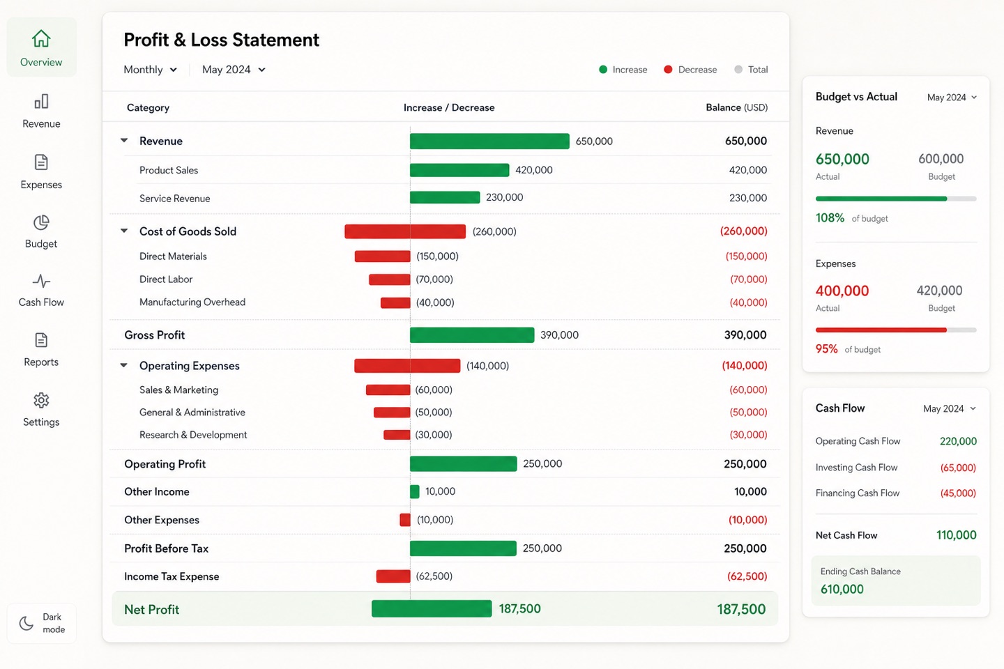
Ledger-style structure: P&L, balance sheet and cash position side by side. Settle units, periods and the sign convention first, and many numbers stop fighting each other.
revenue metricsprofit and lossbudget trackingcash flow
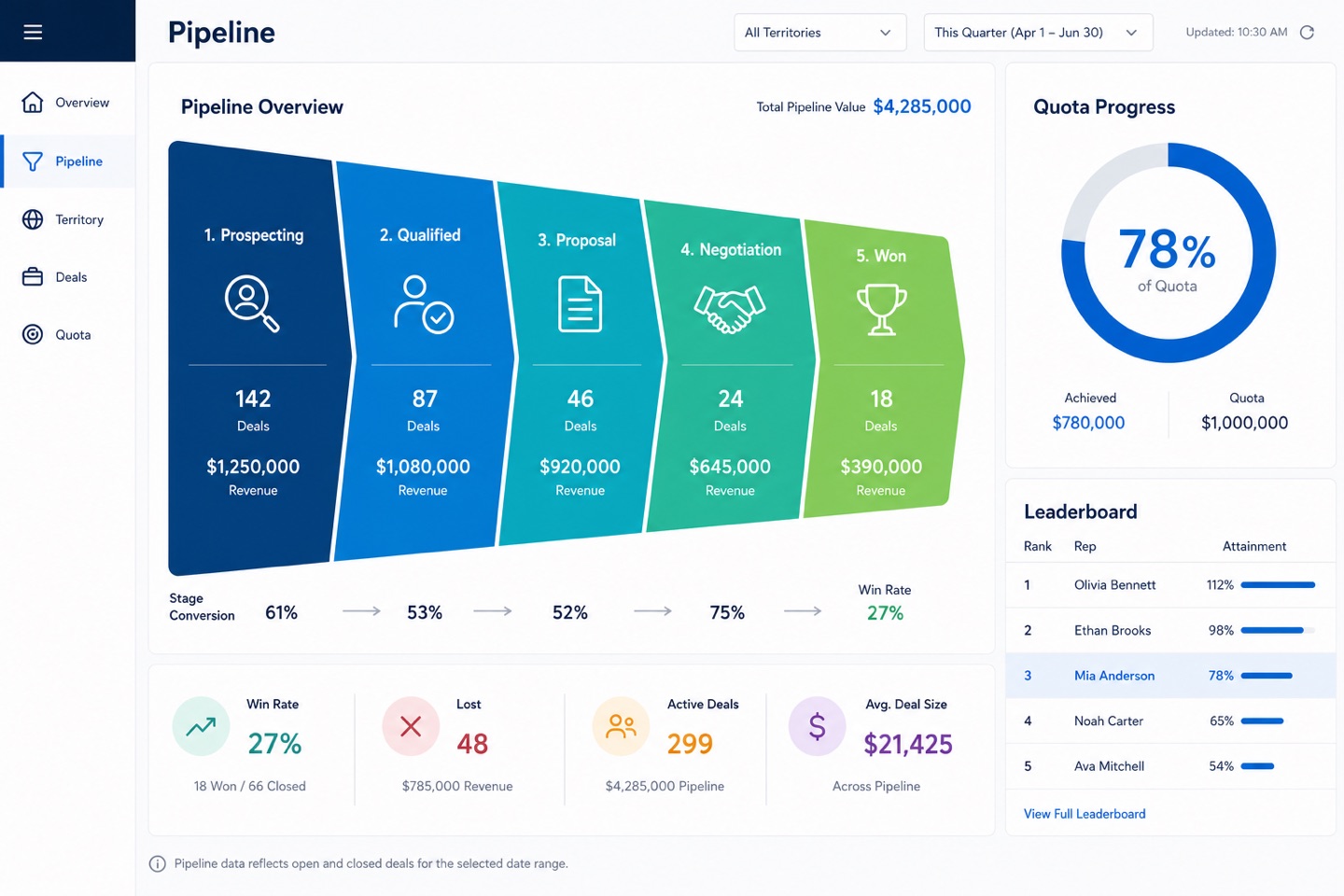
Pipeline, quota and team performance usually share one board. Leaderboards change behavior — write down the metric definitions and refresh times, or the board manages the team for you.
deal pipelinequota trackingterritory performancewin loss
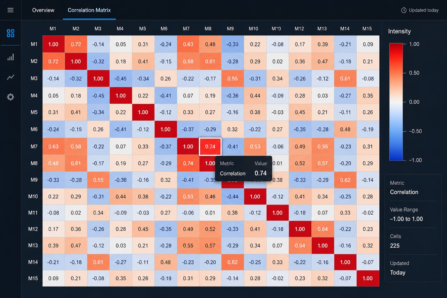
Right for intensity distributions, correlation matrices and geographic density. With thin data, do not force it — an honest bar chart tells the truth better.
color matrixintensity mapcorrelationgradient scale
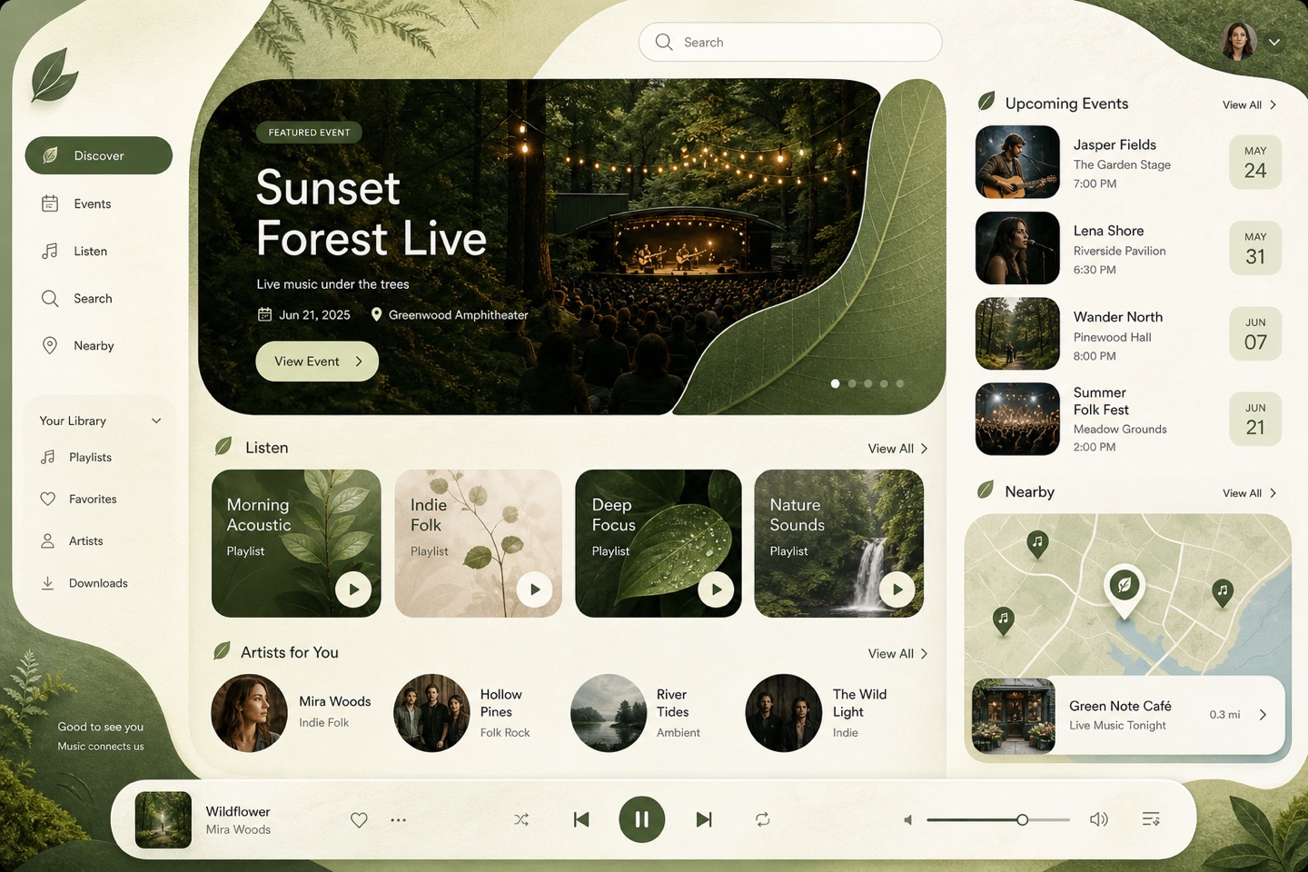
Green is only the surface — soft curves, natural materials and breathing room do the work. Fits health, sustainability and meditation; hard-edged industrial brands look drained in it.
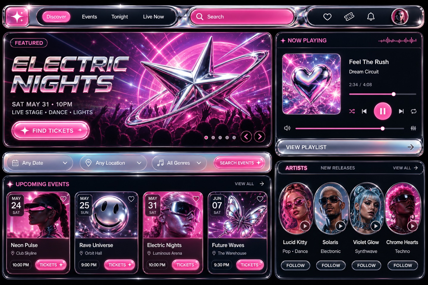
Chrome, jelly colors and millennium-internet energy are the instant identifiers. Fashion and music projects wear it well; serious corporate pages break character immediately.
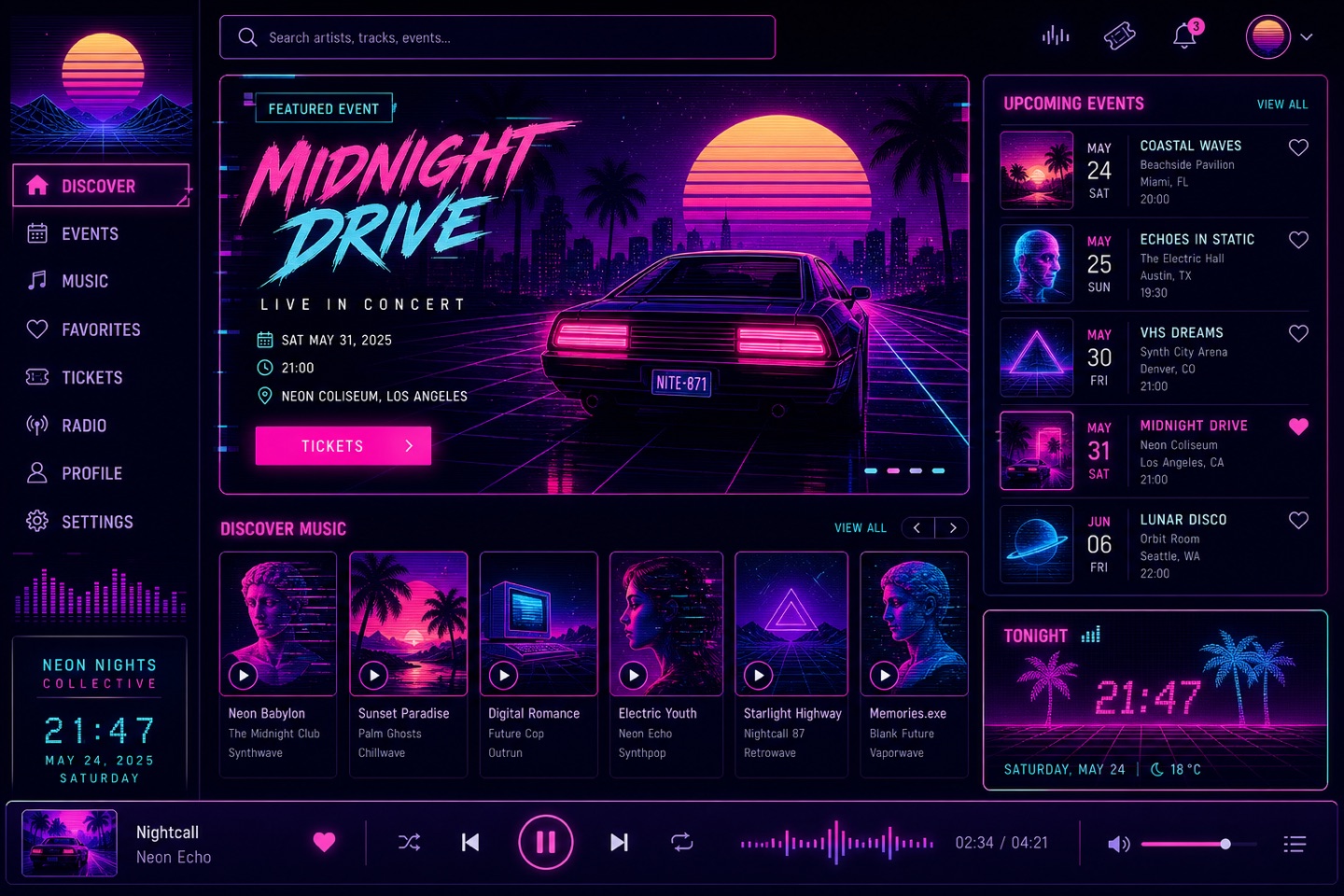
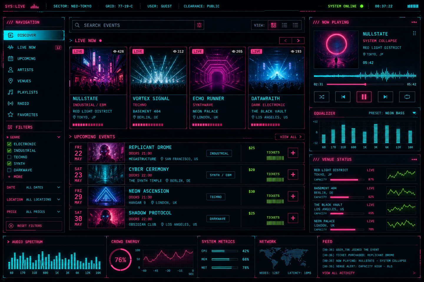
Neon, grids and retro-computer artifacts summon the mood instantly. Music and gaming thrive on it; long text and business tools cannot carry that much emotion.
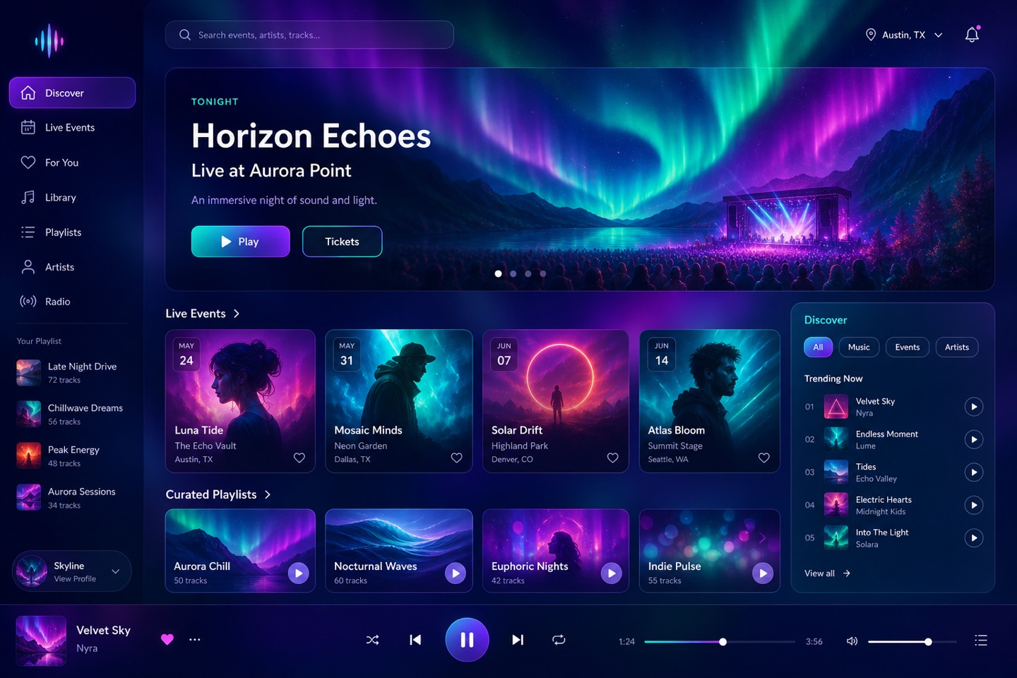
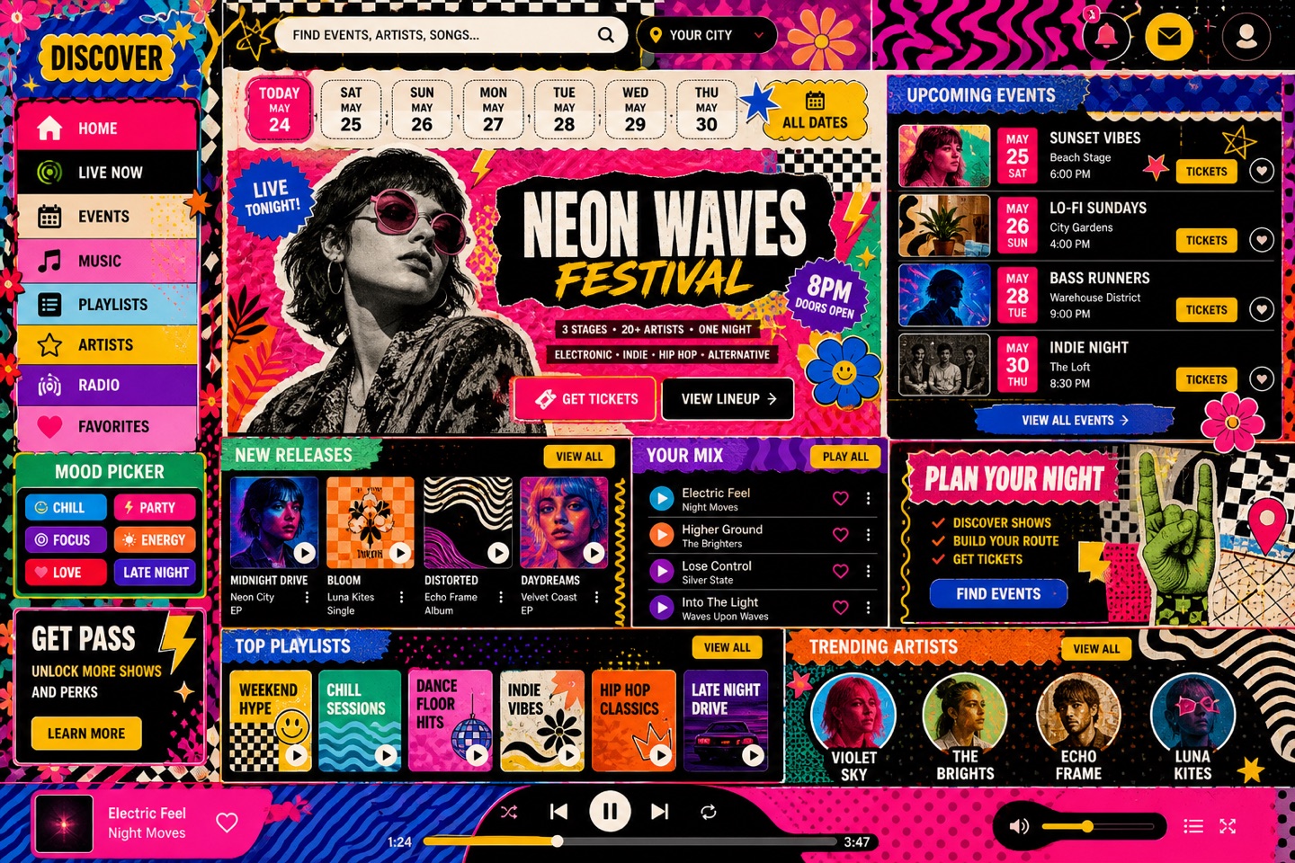
Flowing gradients make a strong first impression for brand sites and give music platforms a soft sense of space. Keep the reading area quiet — a page that glows everywhere tires fast.
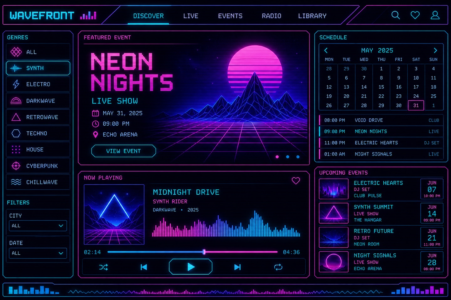
The future as the past imagined it: old-equipment texture plus neon and geometry. Games and tech brands eat it up; information-dense pages need the effects turned well down.
Black ground, fluorescent accents and terminal elements — the attitude arrives instantly. Ration the scanlines and flicker: people still have to finish reading.
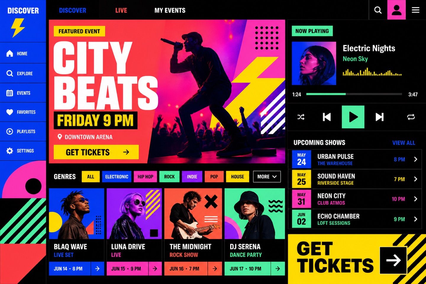
Big color blocks give young brands real energy — and test color discipline hard. Too many hues and the noise buries the information; hold the main palette to a few.
Keeps the web's rawest, most direct face — deliberately unrefined. Independent media and experimental projects suit it; transplanted into enterprise services it usually loses control.
raw layoutdefault typestark contrastunpolished edge
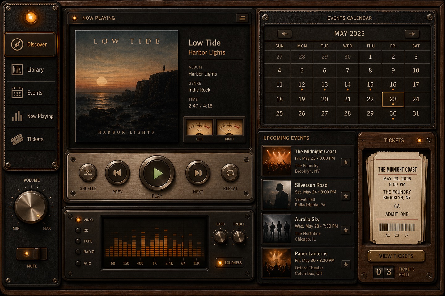
Still valuable when a digital interface needs a real-world object to explain itself. Material, light and detail are expensive to do well — spend them on the key scene, not the whole back office.
Soft, chunky 3D blocks with toy-like charm — made for children's education and playful onboarding. Naturally friendly, naturally unserious: think twice for finance or legal.
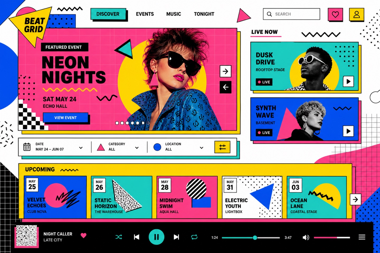
The deliberate opposite of restraint: pattern, color and ornament stacked until the page hums. It rewards brands with real personality — and punishes any hierarchy mistake instantly, because everything is already loud.
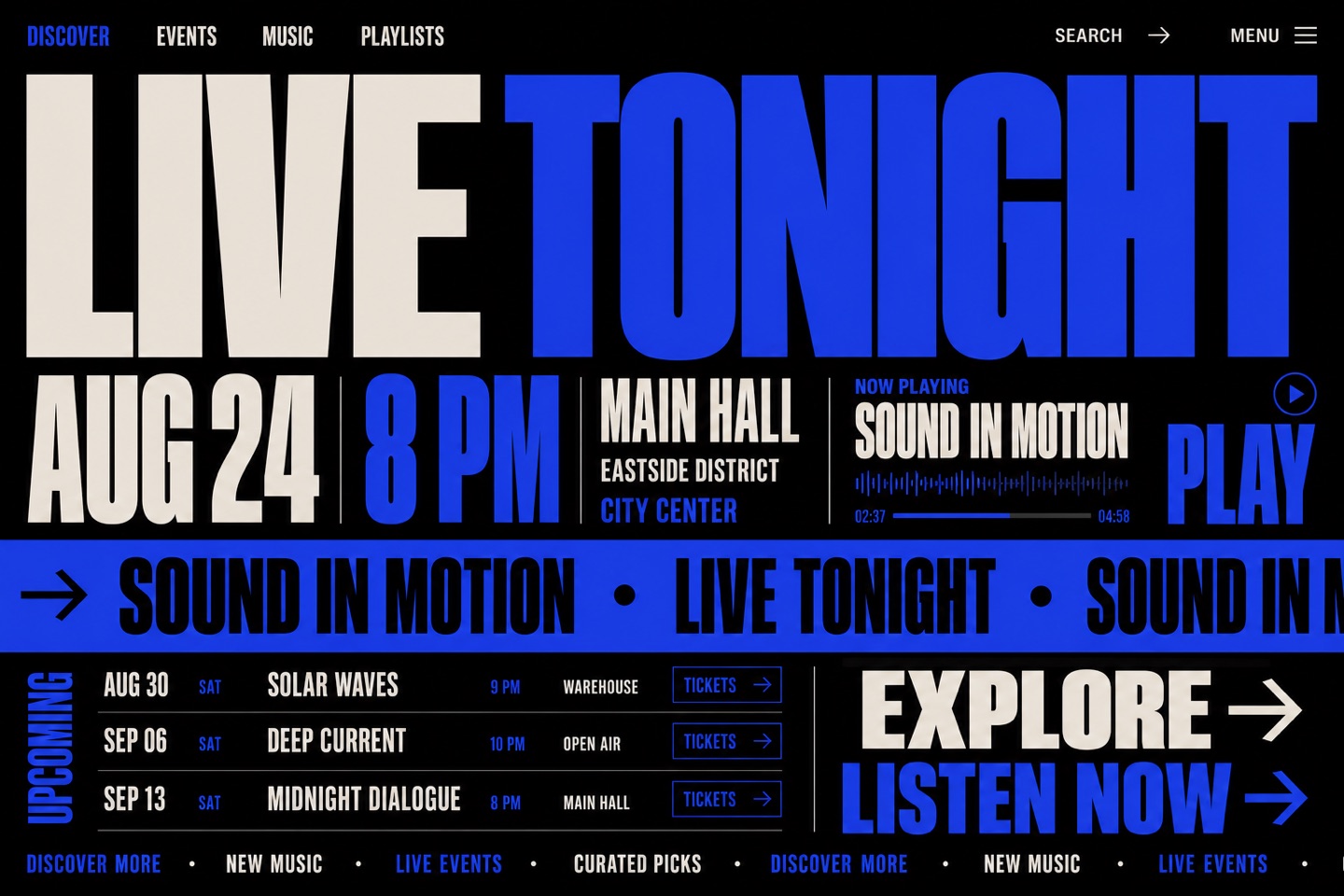
The words are the interface: enormous type, scrolling marquees, letters that respond. Perfect for studios and events; anything that must be read carefully needs the motion held back.
kinetic typeoversized wordsscrolling marqueevariable font
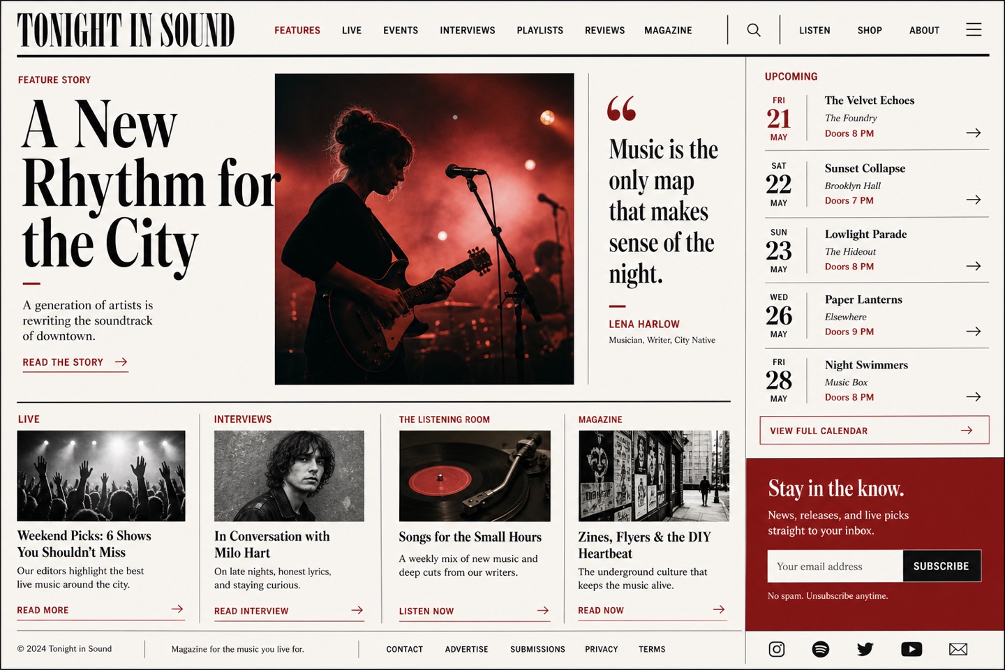
Borrows the authority of print: a strict grid, serif headlines, pull quotes and column rules. Content-led products wear it well — it collapses without real editorial discipline behind it.
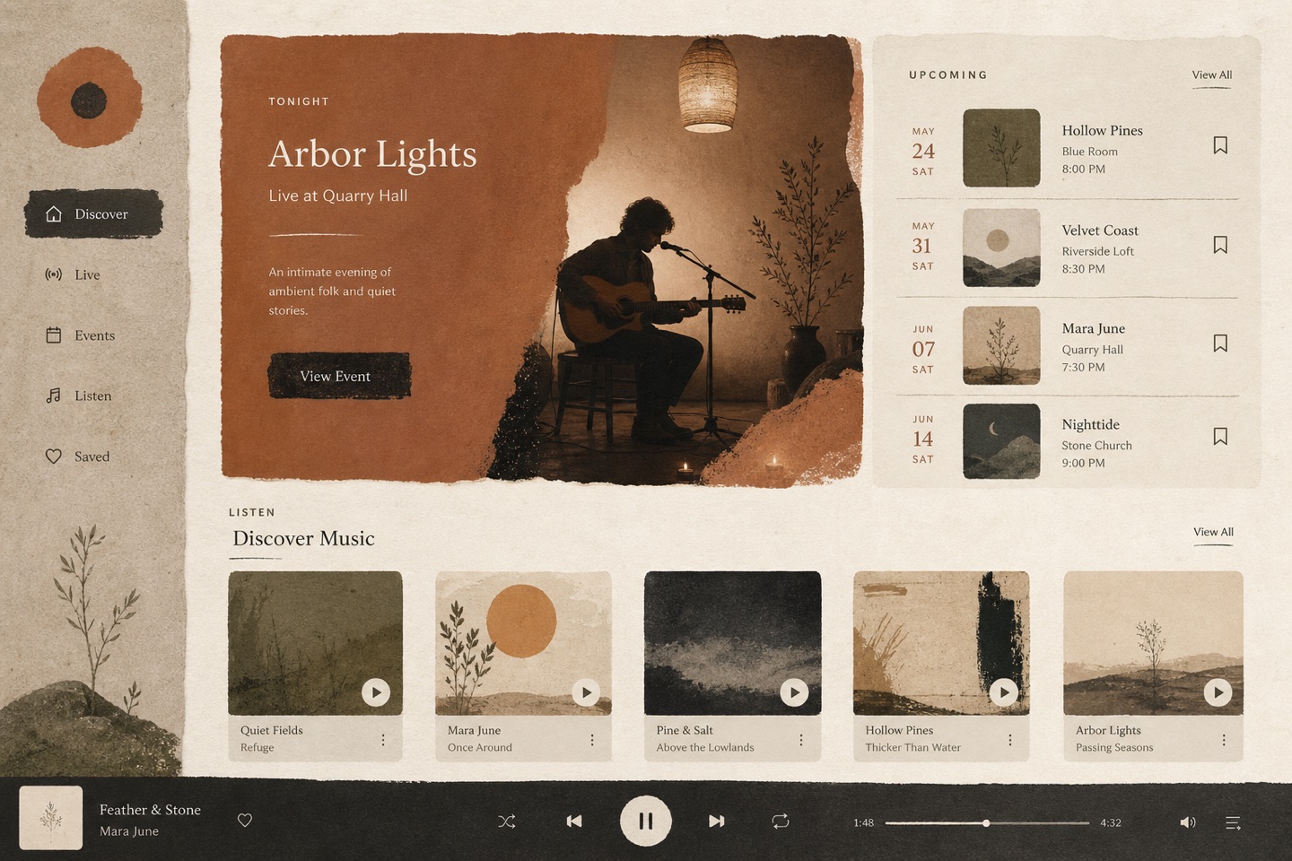
Muted earth tones, handmade texture and compositions that balance without symmetry. Right for craft, tea and slow-living brands — polish it too far and the whole point disappears.
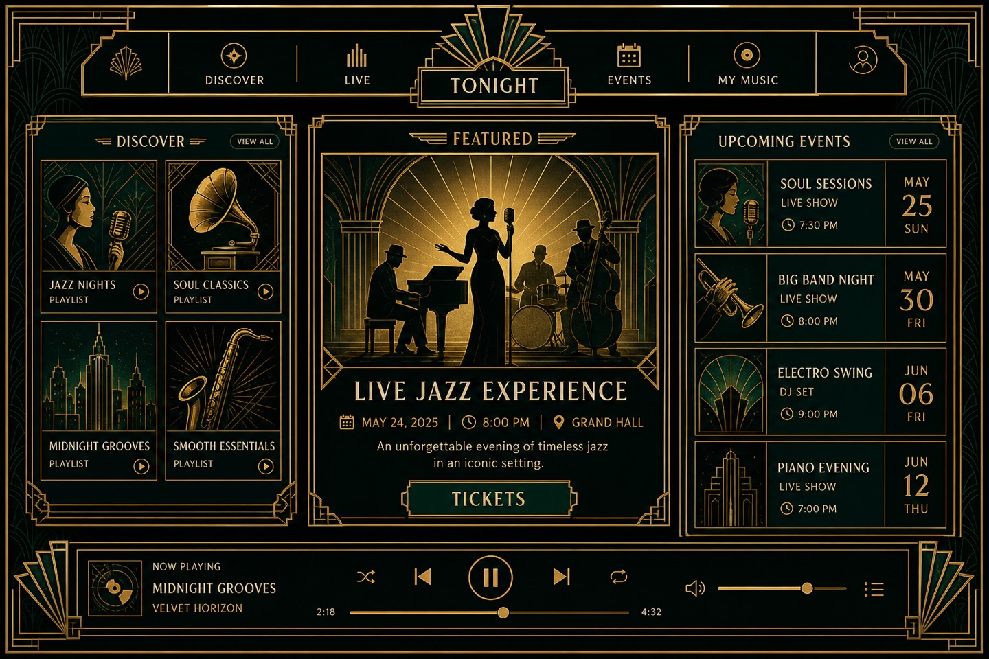
Stepped forms, thin gold rules and strict symmetry — luxury built from geometry rather than photographs. Hotels, events and premium editions love it; it demands typographic patience.
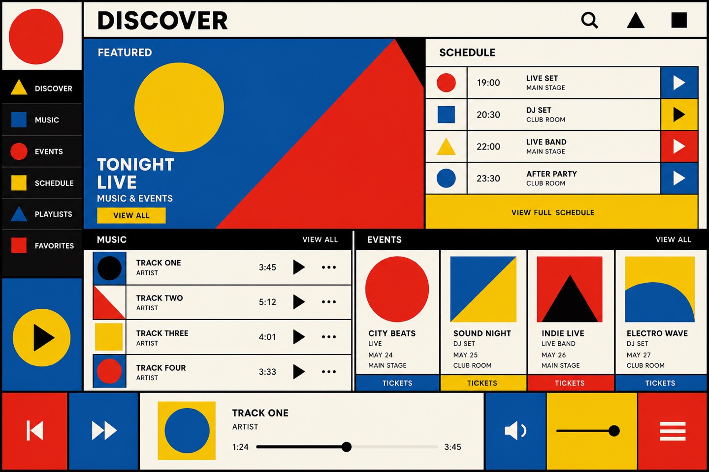
Primary colors, elementary shapes and a grid that means it. The look reads instantly as design literacy; it needs genuine functional clarity underneath or it becomes a poster wearing an interface.
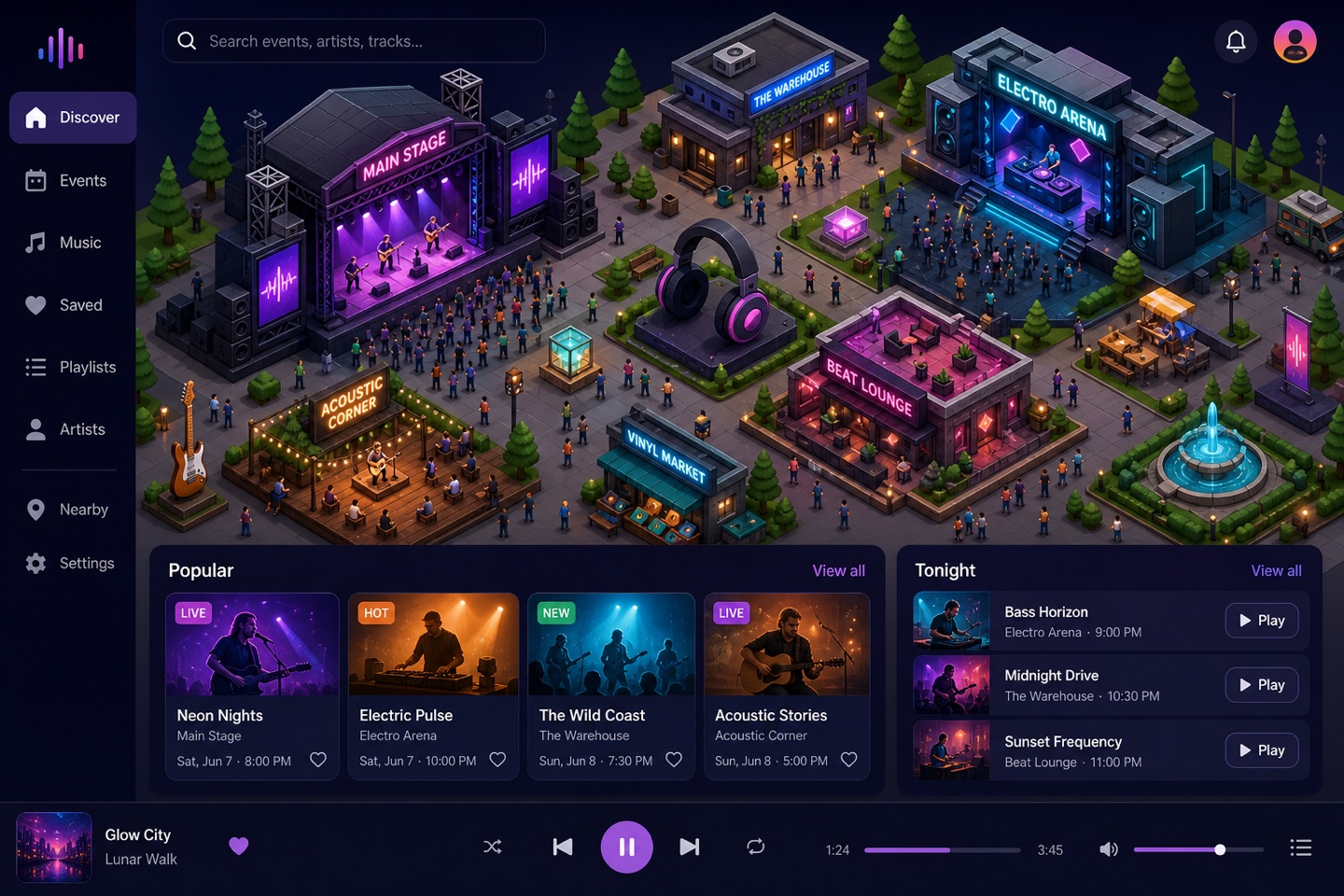
Little 2.5D worlds explain systems better than screenshots: servers, cities, pipelines. Great for developer and infrastructure products — keep the real UI flat so the scene stays special.
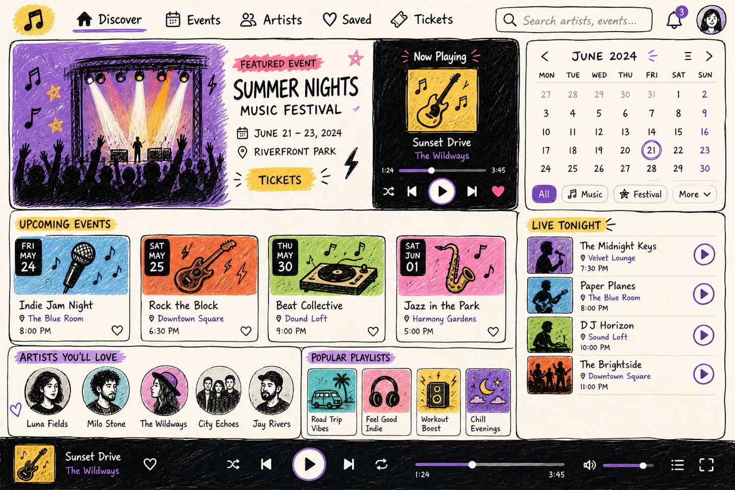
Wobbly borders, marker arrows and doodle icons make software feel human. Education and community products benefit most — the sketch layer decorates, the controls underneath stay precise.
hand drawndoodle iconssketchy bordersmarker strokes
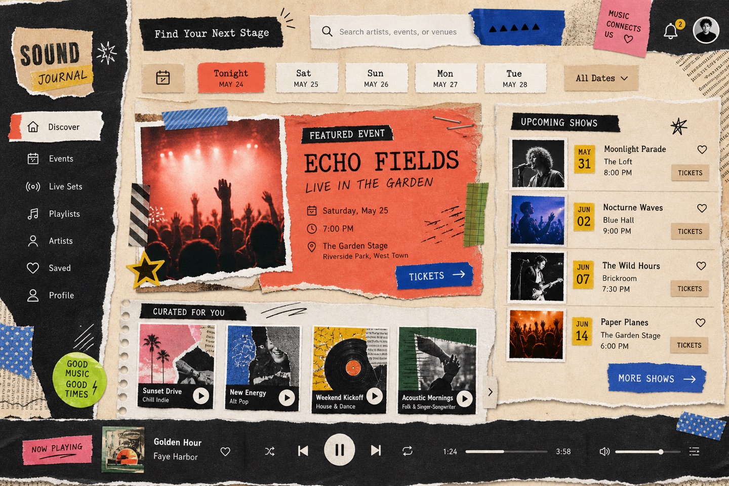
Torn edges, washi tape and overlapping paper make a page feel kept rather than published. Journals, zines and personal brands thrive on it; forms and tables need clean paper to sit on.
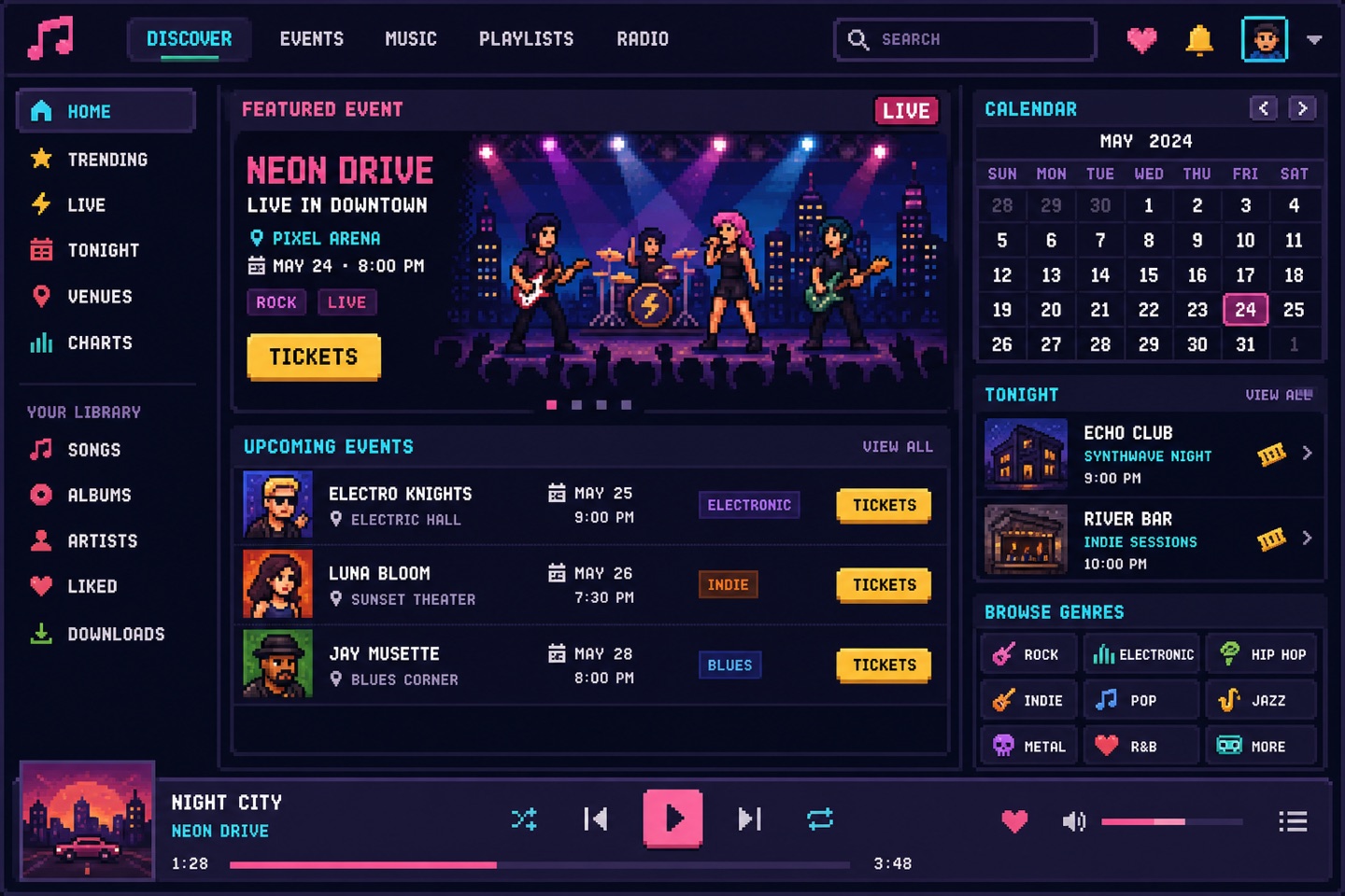
Chunky pixels, dithered gradients and sprite icons carry instant game heritage. Gaming and retro products own it — body text stays a normal readable face or nobody finishes a sentence.
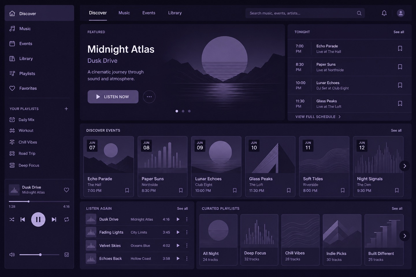
One hue doing every job through tonal steps alone. It photographs beautifully and ages well; states like error and success need shape and label support, because color can no longer differ.
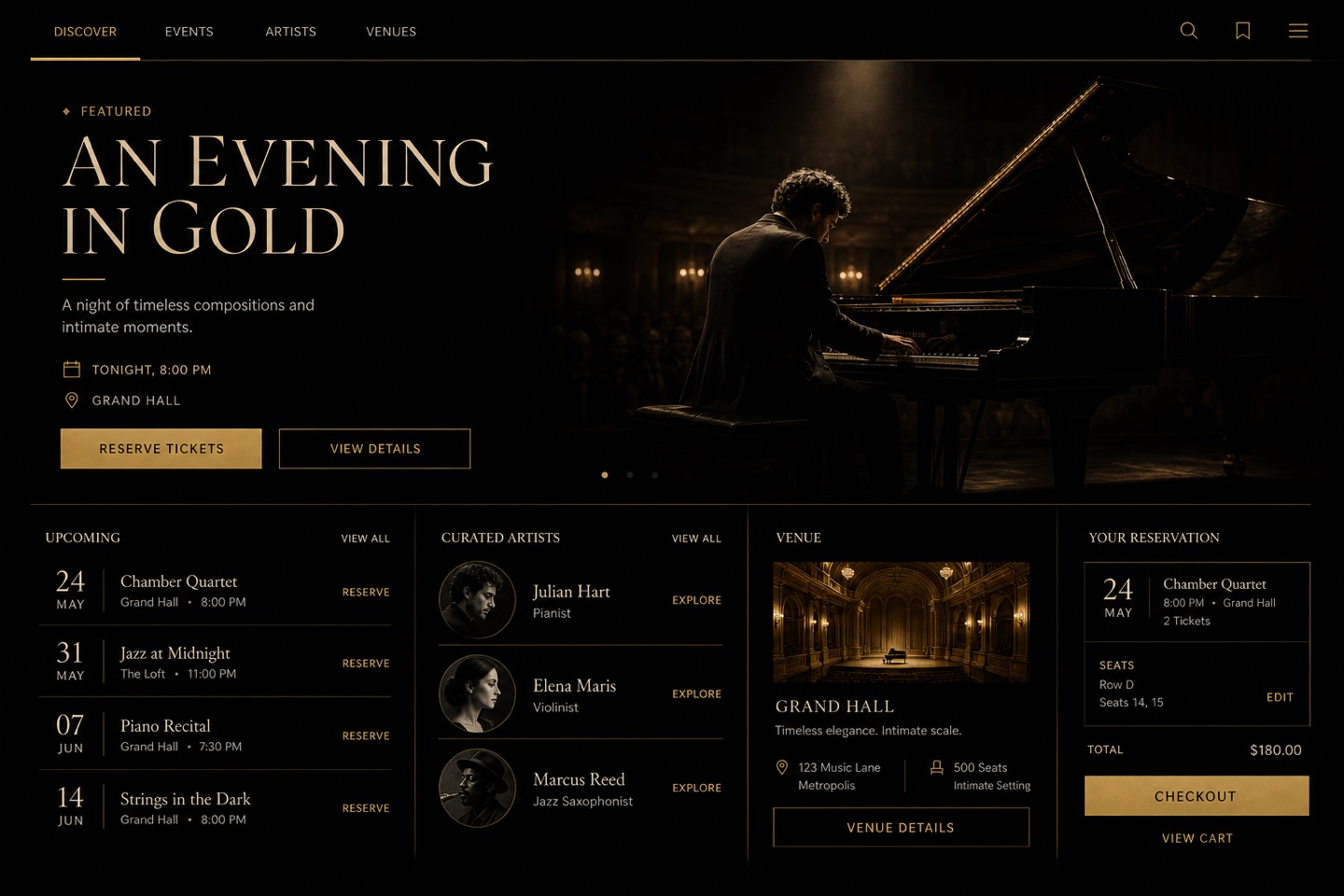
Near-black grounds, restrained gold and a confident serif — premium without a single photograph. Watches, spirits and members' products live here; the gold budget is small on purpose.
black and goldpremium serifdark luxuryfine hairlines