Gallery Lightbox Open
The pressed thumbnail flies out of the grid into the large view while the backdrop dims behind it.
The animated component in this preview is rendered from the canonical file shown here. The surrounding demo shell only provides context and is not part of the copied code.
import { useEffect, useId, useState } from "react";
import { AnimatePresence, motion, useReducedMotion } from "motion/react";

/**
 * Vibary · Gallery Lightbox Open
 *
 * The thumbnail you pressed is the thing that flies: one frame leaves
 * the grid, crosses the panel and becomes the large view, while the
 * backdrop dims underneath it. Closing sends it back to its own cell.
 *
 * Self-contained: depends only on `motion` (react ships with your app).
 * Surfaces are mixed from the inherited text color, so the gallery reads
 * correctly on a light page and on a dark one.
 * Works with zero props; tune via `variant`, `items`.
 * Press a thumbnail; Escape or the backdrop closes it.
 * Requires the automatic JSX runtime (default since React 17).
 */

export type GalleryItem = {
  id: string;
  title: string;
  meta: string;
  /** Real photograph; omit for the gradient stand-in. */
  imageSrc?: string;
  /** Gradient shown while there is no photo. */
  art?: string;
};

export type GalleryLightboxOpenProps = {
  /** Visual character of the motion. */
  variant?: "subtle" | "default" | "playful";
  /** Photographs in the grid; each may carry a real photo via `imageSrc`. */
  items?: readonly GalleryItem[];
  /** Fires with the opened item's id, or null when the view closes. */
  onOpenChange?: (id: string | null) => void;
};

type VariantConfig = {
  /** Spring the frame flies on. */
  spring: { type: "spring"; stiffness: number; damping: number };
  /** Seconds for the backdrop to reach full darkness. */
  backdropFade: number;
  /** Seconds before the caption follows the frame in. */
  captionDelay: number;
  /** How far the caption rises as it fades in, in px. */
  captionLift: number;
};

// Quality rule: the frame is the largest moving object in the library
// after a sheet, and a large surface that overshoots reads as a mistake
// rather than a flourish — so every spring here sits at or above a 0.8
// damping ratio and lands once. The caption is text, so it waits for the
// frame to arrive and then only fades and lifts; it is never carried
// inside the flight, where the layout animation would rescale its glyphs.
const VARIANTS: Record<"subtle" | "default" | "playful", VariantConfig> = {
  // Quick and flat. For a working gallery — an asset picker, a file
  // browser — that gets opened all day.
  subtle: {
    spring: { type: "spring", stiffness: 550, damping: 47 },
    backdropFade: 0.14,
    captionDelay: 0.06,
    captionLift: 2,
  },
  // A visible crossing with one soft settle. All-purpose.
  default: {
    spring: { type: "spring", stiffness: 340, damping: 34 },
    backdropFade: 0.22,
    captionDelay: 0.12,
    captionLift: 6,
  },
  // Slower travel and a later caption, so the arrival is the event —
  // for a portfolio or a product gallery.
  playful: {
    spring: { type: "spring", stiffness: 230, damping: 28 },
    backdropFade: 0.28,
    captionDelay: 0.2,
    captionLift: 10,
  },
};

/** Theme-adaptive neutral: `currentColor` is the text color this component
 *  inherits — near-black on a light page, near-white on a dark one — so
 *  mixing it with `transparent` yields a surface, border or fill that is
 *  correctly toned in either theme. */
const tone = (percent: number) =>
  `color-mix(in srgb, currentColor ${percent}%, transparent)`;

/**
 * Stand-ins for photographs, not UI surfaces: each is two gradients — a
 * light source over a base — so the set reads as imagery without a single
 * asset request. They stay literal in both themes, exactly as a real
 * photograph would.
 */
export const DEFAULT_ITEMS: readonly GalleryItem[] = [
  {
    id: "ridge",
    title: "Ridge line, 06:12",
    meta: "Field study · 4032 x 3024",
    art: "radial-gradient(120% 90% at 22% 12%, rgba(255,236,196,0.92) 0%, rgba(255,236,196,0) 46%), linear-gradient(168deg, #2C5C86 0%, #4F8FB4 52%, #C9B48C 100%)",
  },
  {
    id: "harbour",
    title: "Harbour, low tide",
    meta: "Field study · 3600 x 2700",
    art: "radial-gradient(110% 80% at 78% 18%, rgba(198,238,255,0.7) 0%, rgba(198,238,255,0) 52%), linear-gradient(150deg, #17364A 0%, #2E6B7E 58%, #7FB8A6 100%)",
  },
  {
    id: "atrium",
    title: "Atrium, third floor",
    meta: "Interiors · 4032 x 3024",
    art: "radial-gradient(100% 80% at 30% 84%, rgba(255,205,168,0.72) 0%, rgba(255,205,168,0) 55%), linear-gradient(200deg, #3A2E4C 0%, #6B4E63 55%, #C08E77 100%)",
  },
  {
    id: "dunes",
    title: "Dunes at noon",
    meta: "Field study · 3840 x 2880",
    art: "radial-gradient(120% 90% at 62% 8%, rgba(255,247,214,0.9) 0%, rgba(255,247,214,0) 48%), linear-gradient(175deg, #C79B58 0%, #E0C185 46%, #6E7C6A 100%)",
  },
  {
    id: "quarry",
    title: "Quarry, west face",
    meta: "Field study · 4032 x 3024",
    art: "radial-gradient(100% 90% at 18% 76%, rgba(180,200,220,0.6) 0%, rgba(180,200,220,0) 50%), linear-gradient(190deg, #4A4E58 0%, #7B7F87 50%, #B9A995 100%)",
  },
  {
    id: "greenhouse",
    title: "Glasshouse, late light",
    meta: "Interiors · 3600 x 2700",
    art: "radial-gradient(110% 85% at 70% 88%, rgba(255,222,180,0.68) 0%, rgba(255,222,180,0) 52%), linear-gradient(160deg, #1F4438 0%, #3E7A5B 54%, #B7C777 100%)",
  },
];

/** A photograph fills its frame, layered over the gradient so the tile
 *  never goes blank while the file loads (or if it fails to). */
const artOf = (item: GalleryItem) =>
  item.imageSrc
    ? [`url(${item.imageSrc}) center / cover`, item.art]
        .filter(Boolean)
        .join(", ")
    : item.art;

export default function GalleryLightboxOpen({
  variant = "default",
  items = DEFAULT_ITEMS,
  onOpenChange,
}: GalleryLightboxOpenProps) {
  const [activeId, setActiveId] = useState<string | null>(null);
  const reduceMotion = useReducedMotion();
  const cfg = VARIANTS[variant];

  // Scoped per instance: hard-coded layout ids would make two galleries on
  // the same page trade frames with each other across the document.
  const uid = useId();
  const frameId = (id: string) => `${uid}-frame-${id}`;

  const active = items.find((item) => item.id === activeId) ?? null;

  const open = (id: string) => {
    setActiveId(id);
    onOpenChange?.(id);
  };
  const close = () => {
    setActiveId(null);
    onOpenChange?.(null);
  };

  useEffect(() => {
    if (!activeId) return;
    const onKey = (event: KeyboardEvent) => {
      if (event.key !== "Escape") return;
      setActiveId(null);
      onOpenChange?.(null);
    };
    window.addEventListener("keydown", onKey);
    return () => window.removeEventListener("keydown", onKey);
  }, [activeId, onOpenChange]);

  // Reduced motion: the large view still opens over a dimmed gallery — the
  // frame simply arrives at its destination instead of travelling there.
  const flight = reduceMotion ? { duration: 0 } : cfg.spring;

  return (
    <div
      style={{
        position: "relative",
        width: 338,
        height: 320,
        borderRadius: 18,
        background: tone(6),
        color: "inherit",
        border: `1px solid ${tone(12)}`,
        boxShadow: "0 14px 34px rgba(0,0,0,0.18)",
        overflow: "hidden",
      }}
    >
      <div
        style={{
          display: "flex",
          alignItems: "baseline",
          justifyContent: "space-between",
          padding: "15px 16px 11px",
        }}
      >
        <span style={{ fontSize: 14.5, fontWeight: 650 }}>Library</span>
        <span style={{ fontSize: 11.5, opacity: 0.5 }}>6 items · September</span>
      </div>

      <div
        style={{
          display: "grid",
          gridTemplateColumns: "repeat(3, 1fr)",
          gap: 8,
          padding: "0 16px 16px",
        }}
      >
        {items.map((item) => {
          const isOpen = item.id === activeId;
          return (
            <button
              key={item.id}
              type="button"
              onClick={() => open(item.id)}
              aria-label={`Open ${item.title}`}
              style={{
                position: "relative",
                height: 74,
                padding: 0,
                borderRadius: 11,
                border: 0,
                background: "none",
                cursor: "pointer",
                overflow: "visible",
              }}
            >
              {/* While the item is open its frame lives in the large view,
                  so the cell holds an outline instead. Exactly one element
                  carries a given layout id at a time — that is the whole
                  trick, and doubling it is what makes these transitions
                  jump. */}
              {isOpen ? (
                <span
                  aria-hidden
                  style={{
                    position: "absolute",
                    inset: 0,
                    borderRadius: 11,
                    border: `1px dashed ${tone(20)}`,
                  }}
                />
              ) : (
                <motion.span
                  layoutId={frameId(item.id)}
                  transition={flight}
                  aria-hidden
                  style={{
                    position: "absolute",
                    inset: 0,
                    borderRadius: 11,
                    background: artOf(item),
                    boxShadow: "0 2px 8px rgba(0,0,0,0.18)",
                  }}
                />
              )}
            </button>
          );
        })}
      </div>

      {/* Backdrop, frame and chrome are positioned against this panel
          rather than the viewport, so the pattern drops into a card. For a
          true full-screen lightbox, swap `absolute` for `fixed` on the
          backdrop and on the centring wrapper below. */}
      <AnimatePresence>
        {active && (
          <motion.div
            key="backdrop"
            aria-hidden
            onClick={close}
            initial={{ opacity: 0 }}
            animate={{ opacity: 1 }}
            exit={{ opacity: 0, transition: { duration: cfg.backdropFade * 0.7 } }}
            transition={{ duration: cfg.backdropFade, ease: "easeOut" }}
            style={{
              position: "absolute",
              inset: 0,
              zIndex: 2,
              // A backdrop darkens in both themes, so it stays literal.
              background: "rgba(0,0,0,0.62)",
              cursor: "pointer",
            }}
          />
        )}
      </AnimatePresence>

      {active && (
        <div
          role="dialog"
          aria-modal="true"
          aria-label={active.title}
          style={{
            position: "absolute",
            inset: 0,
            zIndex: 3,
            display: "flex",
            flexDirection: "column",
            justifyContent: "center",
            gap: 10,
            padding: "18px 20px",
            pointerEvents: "none",
          }}
        >
          <motion.div
            layoutId={frameId(active.id)}
            transition={flight}
            style={{
              height: 178,
              borderRadius: 14,
              background: artOf(active),
              boxShadow: "0 22px 50px rgba(0,0,0,0.45)",
            }}
          />

          {/* Caption and chrome are deliberately outside the flying frame:
              anything inside a layout animation is rescaled by it, and
              rescaled type is the tell of a cheap lightbox. They wait, then
              fade in at their own fixed size. */}
          <motion.div
            initial={{ opacity: 0, y: reduceMotion ? 0 : cfg.captionLift }}
            animate={{ opacity: 1, y: 0 }}
            transition={{
              duration: reduceMotion ? 0.12 : 0.22,
              delay: reduceMotion ? 0 : cfg.captionDelay,
              ease: "easeOut",
            }}
            style={{
              display: "flex",
              alignItems: "center",
              justifyContent: "space-between",
              gap: 12,
              padding: "9px 12px",
              borderRadius: 12,
              // Opaque, not toned: this sits above the backdrop, and a
              // translucent bar would composite with it into more backdrop.
              // `Canvas`/`CanvasText` are the CSS system colors for page
              // background and page text, so it lands light in a light app
              // and dark in a dark one.
              background: "Canvas",
              color: "CanvasText",
              border: `1px solid ${tone(14)}`,
              pointerEvents: "auto",
            }}
          >
            <span style={{ minWidth: 0 }}>
              <span
                style={{
                  display: "block",
                  fontSize: 13,
                  fontWeight: 650,
                  whiteSpace: "nowrap",
                  overflow: "hidden",
                  textOverflow: "ellipsis",
                }}
              >
                {active.title}
              </span>
              <span style={{ display: "block", fontSize: 11.5, opacity: 0.55 }}>
                {active.meta}
              </span>
            </span>
            <button
              type="button"
              onClick={close}
              aria-label="Close"
              style={{
                display: "grid",
                placeItems: "center",
                width: 30,
                height: 30,
                flexShrink: 0,
                borderRadius: 15,
                border: `1px solid ${tone(16)}`,
                background: "transparent",
                color: "inherit",
                cursor: "pointer",
              }}
            >
              <svg
                width="14"
                height="14"
                viewBox="0 0 16 16"
                fill="none"
                stroke="currentColor"
                strokeWidth="1.7"
                strokeLinecap="round"
                aria-hidden
              >
                <path d="M4.4 4.4l7.2 7.2M11.6 4.4l-7.2 7.2" />
              </svg>
            </button>
          </motion.div>
        </div>
      )}
    </div>
  );
}About this pattern
A photo viewer where the picture never gets replaced, only moved. The frame the reader pressed leaves its cell, crosses the panel and becomes the large view, so there is never a question of which of six items is now on screen — and closing sends the same frame back to the cell it came from. Two details carry it. The cell keeps an outline while its frame is away, because exactly one element may hold a given shared id at a time and doubling it is what makes these transitions jump. And the caption stays outside the flight entirely: anything travelling inside a layout animation is rescaled by it, so the text waits for the frame to land and then fades in at its own fixed size. The backdrop dims during the crossing rather than before it, which is what makes the grid feel put away rather than covered up.
Where it shows up
Screens we drew to show where this motion usually sits. Illustrations, not captures of any product.
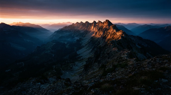
- Photo gallery
Tapping a thumbnail grows that same image into the full-screen viewer.
Related patterns
- Expandable Detail CardA compact card that expands in place into a detail view — image and title travel continuously.
- Modal Scale InA dialog grows the last few percent into place behind a darkening scrim, and leaves the same way.
- Bottom Sheet PresentA sheet rises from the bottom edge over a dimming backdrop and settles once.