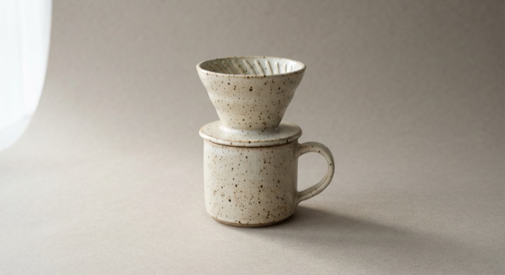
Wishlist Heart Fill
The heart fills from its own center on one soft settle, and drains back out on a plain ease.
The animated component in this preview is rendered from the canonical file shown here. The surrounding demo shell only provides context and is not part of the copied code.
import { useState } from "react";
import { motion, useReducedMotion } from "motion/react";

/**
 * Vibary · Wishlist Heart Fill
 *
 * Saving fills the heart from its own center on one soft settle — no
 * burst, no shower of particles — and unsaving drains it back out on a
 * plain ease, because taking something off a list should not feel like
 * an event.
 *
 * Self-contained: depends only on `motion` (react ships with your app).
 * Surfaces are mixed from the inherited text color, so the row reads
 * correctly on a light page and on a dark one.
 * Works with zero props; tune via `variant`, `imageSrc`, `savedColor`.
 * Requires the automatic JSX runtime (default since React 17).
 */

export type WishlistHeartFillProps = {
  /** Visual character of the motion. */
  variant?: "subtle" | "default" | "playful";
  /** Real photo for the tile. Omitted, the tile draws its own stand-in. */
  imageSrc?: string;
  /** Product title. */
  productName?: string;
  /** Small qualifier under the title. */
  productMeta?: string;
  /** Formatted price. */
  price?: string;
  /** Whether the item starts on the list. */
  initialSaved?: boolean;
  /** Fill color once saved. */
  savedColor?: string;
  /** Fires with the new state on every press. */
  onToggle?: (saved: boolean) => void;
};

type VariantConfig = {
  /** Spring the fill grows on. Exactly one soft settle, then done. */
  fill: { type: "spring"; stiffness: number; damping: number };
  /** How long the fill takes to drain back out. */
  drainSeconds: number;
  /** Crossfade for the outline color and the caption. */
  fadeSeconds: number;
};

// One settle and no more. Damping ratios (damping / 2√stiffness) sit at
// or above 0.81 — enough for the fill to land softly, far too much for
// it to wobble. Variants differ in how soft the landing is, never in how
// many times it happens.
const VARIANTS: Record<"subtle" | "default" | "playful", VariantConfig> = {
  // Straight in, no give. For a listing grid full of these.
  subtle: {
    fill: { type: "spring", stiffness: 800, damping: 54 },
    drainSeconds: 0.13,
    fadeSeconds: 0.11,
  },
  // A single soft landing. All-purpose.
  default: {
    fill: { type: "spring", stiffness: 420, damping: 36 },
    drainSeconds: 0.2,
    fadeSeconds: 0.18,
  },
  // The softest landing the quality bar allows, for a product page where
  // saving is a real decision.
  playful: {
    fill: { type: "spring", stiffness: 300, damping: 28 },
    drainSeconds: 0.27,
    fadeSeconds: 0.25,
  },
};

/** Theme-adaptive neutral: mixing the inherited text color with
 *  `transparent` lands correctly on a light surface and on a dark one.
 *  The saved color stays literal — it carries meaning. */
const tone = (percent: number) =>
  `color-mix(in srgb, currentColor ${percent}%, transparent)`;

const HEART =
  "M12 20.5s-7.7-4.7-7.7-9.9a4.5 4.5 0 0 1 7.7-3.1 4.5 4.5 0 0 1 7.7 3.1c0 5.2-7.7 9.9-7.7 9.9Z";

/** Stand-in for the product shot, so the file stays one copyable unit
 *  with no asset beside it. */
function ProductArt({ imageSrc }: { imageSrc?: string }) {
  if (imageSrc) {
    return (
      <img
        src={imageSrc}
        alt=""
        style={{
          width: "100%",
          height: "100%",
          objectFit: "cover",
          display: "block",
        }}
      />
    );
  }
  return (
    <div
      aria-hidden
      style={{
        width: "100%",
        height: "100%",
        display: "grid",
        placeItems: "center",
        background:
          "linear-gradient(146deg, #F3E7DC 0%, #DFC3A8 48%, #BE9375 100%)",
      }}
    >
      <svg viewBox="0 0 40 40" width="56%" height="56%" fill="none">
        <path
          d="M11 15h18v13a6 6 0 0 1-6 6h-6a6 6 0 0 1-6-6V15Z"
          stroke="#4A3423"
          strokeOpacity="0.5"
          strokeWidth="2"
          strokeLinejoin="round"
        />
        <path
          d="M29 19h3.2a4 4 0 0 1 0 8H29"
          stroke="#4A3423"
          strokeOpacity="0.5"
          strokeWidth="2"
          strokeLinecap="round"
        />
        <path
          d="M16 9v3.4M20 8v4.4M24 9v3.4"
          stroke="#4A3423"
          strokeOpacity="0.32"
          strokeWidth="2"
          strokeLinecap="round"
        />
      </svg>
    </div>
  );
}

export default function WishlistHeartFill({
  variant = "default",
  imageSrc,
  productName = "Stoneware pour-over set",
  productMeta = "Matte oat · 600 ml",
  price = "$74.00",
  initialSaved = false,
  savedColor = "#E0526B",
  onToggle,
}: WishlistHeartFillProps) {
  const reduceMotion = useReducedMotion();
  const cfg = VARIANTS[variant];
  const [saved, setSaved] = useState(initialSaved);

  const toggle = () => {
    const nextSaved = !saved;
    setSaved(nextSaved);
    onToggle?.(nextSaved);
  };

  return (
    <div
      style={{
        display: "flex",
        alignItems: "center",
        gap: 12,
        width: 272,
        padding: 12,
        borderRadius: 14,
        background: tone(5),
        border: `1px solid ${tone(10)}`,
        fontSize: 13,
      }}
    >
      <div
        style={{
          width: 56,
          height: 56,
          flexShrink: 0,
          borderRadius: 11,
          overflow: "hidden",
        }}
      >
        <ProductArt imageSrc={imageSrc} />
      </div>

      <div style={{ display: "grid", gap: 3, minWidth: 0, flex: 1 }}>
        <span style={{ fontSize: 13, fontWeight: 600, lineHeight: 1.25 }}>
          {productName}
        </span>
        <span style={{ fontSize: 11.5, opacity: 0.5 }}>{productMeta}</span>
        <span
          style={{
            fontSize: 12.5,
            fontWeight: 600,
            fontVariantNumeric: "tabular-nums",
          }}
        >
          {price}
        </span>
      </div>

      <button
        type="button"
        onClick={toggle}
        aria-pressed={saved}
        aria-label={saved ? "Saved to your list" : "Save to your list"}
        style={{
          position: "relative",
          width: 40,
          height: 40,
          flexShrink: 0,
          display: "grid",
          placeItems: "center",
          padding: 0,
          borderRadius: 999,
          border: 0,
          background: "transparent",
          color: "inherit",
          cursor: "pointer",
        }}
      >
        {/* The tinted plate behind the glyph is a solid color faded in
            and out, never a color interpolated between two mixes. */}
        <motion.span
          aria-hidden
          initial={false}
          animate={{ opacity: saved ? 1 : 0 }}
          transition={{ duration: cfg.fadeSeconds, ease: "easeOut" }}
          style={{
            position: "absolute",
            inset: 0,
            borderRadius: 999,
            background: `color-mix(in srgb, ${savedColor} 14%, transparent)`,
          }}
        />
        <svg width="23" height="23" viewBox="0 0 24 24" fill="none" aria-hidden>
          {/* Two outlines in the same place, crossfading. The shape of the
              control never changes; only which of them you can see. */}
          <motion.path
            d={HEART}
            stroke="currentColor"
            initial={false}
            animate={{ opacity: saved ? 0 : 0.65 }}
            transition={{ duration: cfg.fadeSeconds, ease: "easeOut" }}
            strokeWidth="1.7"
            strokeLinejoin="round"
          />
          <motion.path
            d={HEART}
            stroke={savedColor}
            initial={false}
            animate={{ opacity: saved ? 1 : 0 }}
            transition={{ duration: cfg.fadeSeconds, ease: "easeOut" }}
            strokeWidth="1.7"
            strokeLinejoin="round"
          />
          {/* The fill grows out of the middle of the heart. `fill-box`
              puts the origin at the center of the path itself, so the
              growth is symmetrical whatever the viewBox says. */}
          <motion.path
            d={HEART}
            fill={savedColor}
            initial={false}
            animate={
              reduceMotion
                ? { scale: 1, opacity: saved ? 1 : 0 }
                : { scale: saved ? 1 : 0, opacity: 1 }
            }
            transition={
              reduceMotion
                ? { duration: cfg.fadeSeconds, ease: "easeOut" }
                : saved
                  ? cfg.fill
                  : { duration: cfg.drainSeconds, ease: "easeIn" }
            }
            style={{ transformBox: "fill-box", transformOrigin: "center" }}
          />
        </svg>
      </button>
    </div>
  );
}About this pattern
Saving something is a small act, so it gets a small motion: the filled shape grows out of the middle of the outline on a single soft settle and stops. No burst, no shower of particles, no second bounce — a control pressed dozens of times in a session cannot afford a celebration each time. Unsaving reverses on a plain ease-in rather than replaying the settle backwards, because taking an item off a list should feel like an undo, not an event. Two outlines crossfade in place so the shape of the control itself never changes.
Where it shows up
Screens we drew to show where this motion usually sits. Illustrations, not captures of any product.
- Product page
The save heart on a listing card fills solid with a single soft landing.